6 Raster and mean spike rate plots
6.1 Data sets
This section will rely on some of the unbinned and binned data we exported in final steps of the previous section. We’ll start by loading in information
## File paths and basenames of _unbinned.csv files
unbinned_filelist <-
  list.files("./data/", pattern = "_unbinned.csv",
             full.names = TRUE)
unbinned_basenames <-
  unbinned_filelist %>%
  str_remove("./data/") %>%
  str_remove("_unbinned.csv")

## File paths and basenames of _binsize10.csv files
bin10_filelist <-
  list.files("./data/", pattern = "_binsize10.csv",
             full.names = TRUE)
bin10_basenames <-
  bin10_filelist %>%
  str_remove("./data/") %>%
  str_remove("_binsize10.csv")

## File paths and basenames of _binsize100.csv files
bin100_filelist <-
  list.files("./data/", pattern = "_binsize100.csv",
             full.names = TRUE)
bin100_basenames <-
  bin100_filelist %>%
  str_remove("./data/") %>%
  str_remove("_binsize100.csv")
You should have something similar to the following:
unbinned_filelist; unbinned_basenames; bin10_filelist; bin10_basenames; bin100_filelist; bin100_basenames## [1] "./data/2023-02-16_001_unbinned.csv"## [1] "2023-02-16_001"## [1] "./data/2023-02-16_001_binsize10.csv"## [1] "2023-02-16_001"## [1] "./data/2023-02-16_001_binsize100.csv"## [1] "2023-02-16_001"6.2 Raster plot
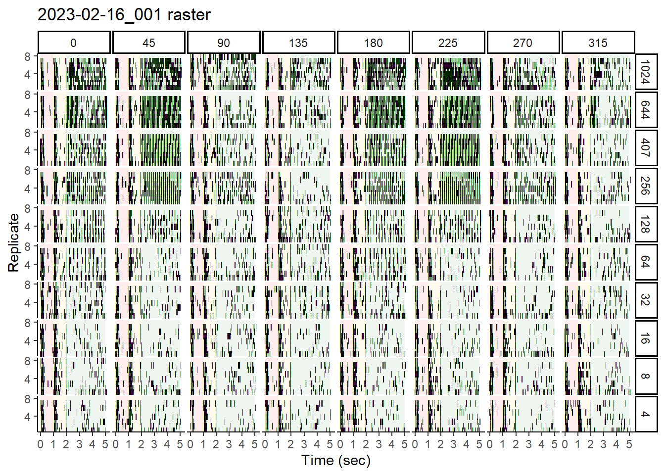
Here is an example of a raster plot, using the wrangled data generated in the previous section. This type of plot shows the timing of spike events within each replicate sweep, and for our purposes, we’ll produce a view of this for each of the various stimulus conditions
It is important to note that we will need unbinned data for this. This is because a raster plot shows discrete spiking events through the course of a time sweep.
Here, we will use ggplot to create a plot with:
- Data sub-plotted by stimulus (i.e., Speed and Direction)
- Standardized sweep time on the x-axis, with delineation among blank, stationary, and moving phases using red, yellow, and green undershading. The y-axis will indicate replicate number
- A black tick each time a spike is observed. Absence of black tick = no observed spike
## For each unbinned file, generate a raster plot
rasterplots <- NULL
for (i in 1:length(unbinned_filelist)) {
  ## Read in the data
  unbinned_data <-
    read_csv(unbinned_filelist[i]) %>%
    as_tibble()

  ## determine the max number of replicates
  max_reps <- max(unbinned_data$Replicate)

  ## get unique speeds
  sorted_speeds <-
    unbinned_data$Speed %>% unique %>% sort(decreasing = TRUE)

  ## Generate the code for the ggplot and save it as rasterplots[[i]]
  rasterplots[[i]] <-
    unbinned_data %>%
    ## Remove any rows where spiking does not occur in the Spikes column
    filter(Spikes == 1) %>%
    ## Convert Trial and Speed into factors and specify their level ordering
    ## This will make it easier to get the subplots in the order we want them
    mutate(
      Trial = factor(Trial,
                     levels = c("blank", "stationary", "moving")),
      Speed = factor(Speed,
                     levels = sorted_speeds)) %>%
    ggplot(aes(x = Time_stand, y = Replicate)) +
    ## The next three blocks will undershade each subplot according to stimulus
    ## phase (i.e., blank, stationary, moving)
    annotate("rect",
             xmin = 0, xmax = first(unbinned_data$Blank_end),
             ymin = 0.5, ymax = max_reps + 0.5,
             alpha = 0.075, color = NA, fill = "red") +
    annotate("rect",
             xmin = first(unbinned_data$Blank_end),
             xmax = first(unbinned_data$Static_end),
             ymin = 0.5, ymax = max_reps + 0.5,
             alpha = 0.075, color = NA, fill = "darkgoldenrod1") +
    annotate("rect",
             xmin = first(unbinned_data$Static_end), xmax = 5,
             ymin = 0.5, ymax = max_reps + 0.5,
             alpha = 0.075, color = NA, fill = "forestgreen") +
    ## Up to 10 replicates were used, so we will force the y-axis to go to 10
    scale_y_continuous(
      limits = c(0.5, max_reps + 0.5),
      expand = c(0, 0),
      breaks = c(max_reps/2, max_reps)
    ) +
    ## There are multiple ways to plot a spike event. Since 100% of the rows in
    ## this filtered data set are spike events, we can simply plot a symbol at
    ## each time (Time_stand) that appears in the data. The `|` symbol is a good
    ## choice.
    geom_point(pch = '|', size = 1.5) +
    xlab("Time (sec)") +
    ggtitle(paste0(unbinned_basenames[i], " raster")) +
    ## Use facet_grid() to create a grid of subplots. Rows will correspond to
    ## Speeds, and columns correspond to Directions
    facet_grid(rows = vars(Speed), cols = vars(Direction)) +
    theme_classic() +
    theme(legend.position = 'none',
          panel.spacing = unit(0.1, "lines"))

  ## Clean up
  rm(unbinned_data)
}
rasterplots is now an object in the environment that contains one plot
per imported data file. To plot, simply call the index of the file you
wish to see. Since we only have 1 example file, we’ll showcase the only
plot here:
## Here's the raster plot
rasterplots[[1]]
6.3 Mean spike rate plots
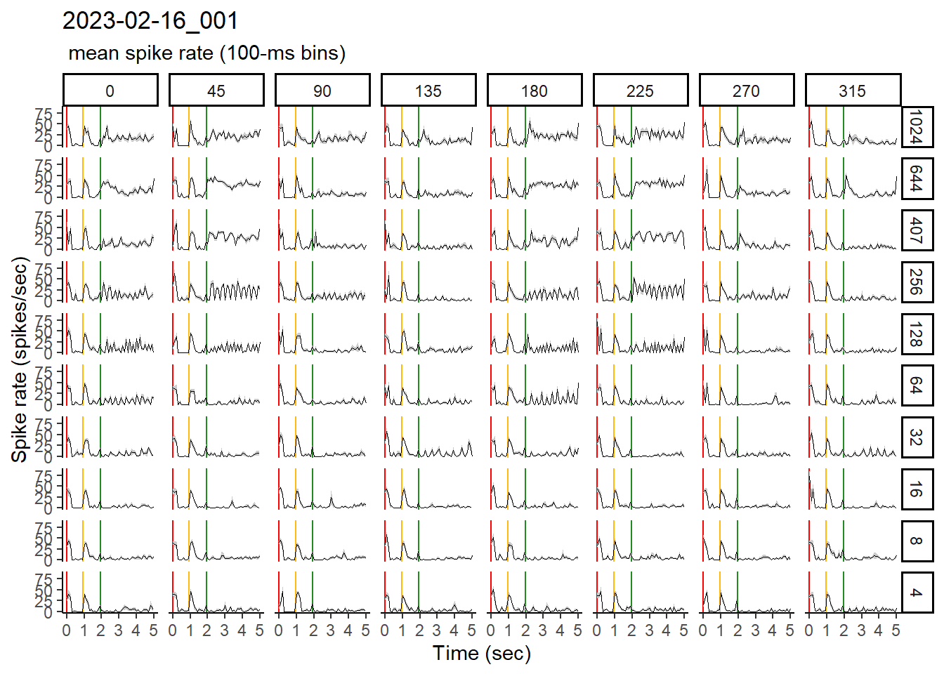
To visualize the mean spike rate over the course of the stimulus sweep, I typically elect to use 100ms-binned data. This format of the data allows me to see the salient spike rate patterns without focusing on every little variation in the data.
Here, we will use ggplot to create a plot with:
- Data sub-plotted by stimulus (i.e., Speed and Direction)
- Standardized sweep time on the x-axis, with delineation among blank, stationary, and moving phases
- A black line to indicate the mean spike rate, along with a grey ribbon to show +/- 1 S.E.M.
## For each 100-ms binned file, generate a mean spike plot
bin100_msr_plots <- NULL
for (i in 1:length(bin100_filelist)) {
  ## Read in the data
  bin100_data <-
    read_csv(bin100_filelist[i]) %>%
    as_tibble()

  ## get unique speeds
  sorted_speeds <-
    bin100_data$Speed %>% unique %>% sort(decreasing = TRUE)

  ## Compute SE and other metrics and add this to our data set
  dataslices_100 <-
    bin100_data %>%
    mutate(
      Speed = factor(Speed,
                     levels = sorted_speeds)) %>%
    ## Split by direction and speed, because we will use those to define each
    ## subplot
    group_split(Direction, Speed) %>%
    ## Group by time bin
    purrr::map(group_by, bin) %>%
    ## Within each time bin, compute the following:
    purrr::map(transmute,
               ## first() can be used for metadata such as Speed or Direction
               Speed = first(Speed),
               Direction = first(Direction),
               ## I generally compute the mean within each bin for the following:
               Time_stand = mean(Time_stand),
               Blank_end = mean(Blank_end),
               Static_end = mean(Static_end),
               Mean_spike_rate = mean(Spike_rate),
               ## To get SE, divide s.d. by the square root of sample size
               Spike_rate_SE = sd(Spike_rate)/sqrt(n()),
               Mean_photod_rate = mean(Photod_mean),
               ## SE of photodiode
               Photod_SE = sd(Photod_mean)/sqrt(n())
    ) %>%
    purrr::map(ungroup) %>%
    bind_rows()

  ## Generate the mean spike rate plot using ggplot
  bin100_msr_plots[[i]] <-
    dataslices_100 %>%
    ## The same code block can be used to generate either the mean spike rate
    ## (shown below) or photodiode trace (commented out)
    ggplot(aes(x = Time_stand,
               y = Mean_spike_rate #Mean_photod_rate
    )) +
    ## We'll actually start by placing red, yellow, and green vertical lines to
    ## distinguish between blank, stationary, and moving phases
    ## This comes first so that it is the bottom-most layer and doesn't obstruct
    ## the data
    geom_vline(xintercept = 0, col = "red") +
    geom_vline(xintercept = first(dataslices_100$Blank_end),
               col = "darkgoldenrod1") +
    geom_vline(xintercept = first(dataslices_100$Static_end),
               col = "forestgreen") +
    ## We'll use `geom_ribbon()` to shade in the SE traces
    geom_ribbon(aes(
      ymin = Mean_spike_rate - Spike_rate_SE,
      ymax = Mean_spike_rate + Spike_rate_SE
      # ymin = Mean_photod_rate - Photod_SE,
      # ymax = Mean_photod_rate + Photod_SE
    ),
    fill = "grey80") +
    ## `geom_line()` will be used to draw the mean spike rate itself on top of
    ## the SE traces
    geom_line(linewidth = 0.05) +
    ## Add a title to help us know what cell this is
    ggtitle(bin100_basenames[i], " mean spike rate (100-ms bins)") +
    xlab("Time (sec)") +
    ylab("Spike rate (spikes/sec)") +
    ## To sub-plot by Speed and Direction, I typically use `facet_grid()`. This
    ## method allows me to explicitly declare what the row- and column-wise
    ## grouping variables are
    facet_grid(rows = vars(Speed), cols = vars(Direction)) +
    theme_classic()

  rm(bin100_data, dataslices_100)
}
bin100_msr_plots is now an object in the environment that contains one plot
per imported data file. To plot, simply call the index of the file you
wish to see. Since we only have 1 example file, we’ll showcase the only
plot here:
## Here's the spike rate plot
bin100_msr_plots[[1]]
6.4 Export to PDF
Should you elect to export either of these sets of plots as PDFs, here is an
example of what you could do.
## Use the `pdf()` function to start the graphics device driver for producing
## PDFs
## Aspects such as page size and centering mode can be adjusted
for (i in 1:length(rasterplots)) {
  pdf(file =
        paste0("./plot_pdfs/",
               unbinned_basenames[i],
               "_raster.pdf"),
      width = 22, height = 12,
      pagecentre = TRUE, colormodel = "srgb")
  ## Now add the plot to the PDF simply by calling plot()
  plot(rasterplots[[i]])
  ## To declare an end to this PDF writing session, use `dev.off()`
  dev.off()
}

for (i in 1:length(bin100_msr_plots)) {
  pdf(file =
        paste0("./plot_pdfs/",
               bin100_basenames[i],
               "_raster.pdf"),
      width = 22, height = 12,
      pagecentre = TRUE, colormodel = "srgb")
  plot(bin100_msr_plots[[i]])
  dev.off()
}