Part 2: Piping and producing single-panel ggplot figures
by Vikram B. Baliga, Andrea Gaede and Shreeram Senthivasan
Last updated on 2022-09-23 12:18:17
Source:vignettes/group-02_Piping-single-panel-ggplot-figs.Rmd
group-02_Piping-single-panel-ggplot-figs.RmdIntroduction
This vignette is Part 2 of 3 for an R workshop created for BIOL 548L, a graduate-level course taught at the University of British Columbia.
When the workshop runs, we split students into three groups with successively increasing levels of difficulty. To make sense of what follows, we recommend working through (or at least looking at) Part 1’s vignette.
The goal of Part 2’s vignette is to learn how to structure data to produce single plots ready for presentations and publications
Part 3’s vignette (which we recommend going through only after completing this page) can be found here.
All code and contents of this vignette were written together by Vikram B. Baliga, Andrea Gaede and Shreeram Senthivasan.
You can get all data used in this vignette (and the other two!) by downloading this zip file.
Learning Objectives:
- Articulate the advantages of literate programming
- Employ piping to restructure data for tidyverse
- Describe the grammar of graphics that underlies plotting in ggplot
- Manipulate plots to improve clarity and maximize the data : ink ratio
Load or install&load packages
We’ll first load packages that will be necessary. The
package.check() function below is designed to first see if
each package is already installed. If any aren’t, the function then
installs them from CRAN. Then all the packages are loaded.
The code block is modified from this blog post
## Modified from:
## https://vbaliga.github.io/verify-that-r-packages-are-installed-and-loaded/

## First specify the packages of interest
packages <-
  c("gapminder",
    "ggplot2",
    "tidyr",
    "dplyr",
    "tibble",
    "readr",
    "forcats",
    "readxl",
    "ggthemes",
    "magick",
    "grid",
    "cowplot",
    # ggmap and maps are optional; needed for creating maps
    "ggmap",
    "maps")

## Now load or install&load all packages
package.check <-
  lapply(
    packages,
    FUN = function(x)
    {
      if (!require(x, character.only = TRUE))
      {
        install.packages(x, dependencies = TRUE,
                         repos = "http://cran.us.r-project.org")
        library(x, character.only = TRUE)
      }
    }
  )
Data sets
You can get all data used in this vignette (and the other two!) by downloading this zip file.
What is literate programming?
“Literate programming” rethinks the “grammar” of traditional code to more closely resemble writing in a human language, like English.
The primary goal of literate programming is to move away from coding “for computers” (ie, code that simplifies compilation) and instead to write in a way that more resembles how we think.
In addition to making for much more readable code even with fewer comments, a good literate coding language should make it easier for you to translate ideas into code.
In the tidyverse, we will largely use the analogy of
variables as nouns and functions as verbs that operate on the nouns.
The main way we will make our code literate however is with the pipe:
%>%
What is a pipe?
A pipe, or %>%, is an operator that takes everything
on the left and plugs it into the function on the right.
In short: x %>% f(y) is equivalent to
f(x, y)
# So:
filter(gapminder, continent == 'Asia')
#> # A tibble: 396 × 6
#>    country     continent  year lifeExp      pop gdpPercap
#>    <fct>       <fct>     <int>   <dbl>    <int>     <dbl>
#>  1 Afghanistan Asia       1952    28.8  8425333      779.
#>  2 Afghanistan Asia       1957    30.3  9240934      821.
#>  3 Afghanistan Asia       1962    32.0 10267083      853.
#>  4 Afghanistan Asia       1967    34.0 11537966      836.
#>  5 Afghanistan Asia       1972    36.1 13079460      740.
#>  6 Afghanistan Asia       1977    38.4 14880372      786.
#>  7 Afghanistan Asia       1982    39.9 12881816      978.
#>  8 Afghanistan Asia       1987    40.8 13867957      852.
#>  9 Afghanistan Asia       1992    41.7 16317921      649.
#> 10 Afghanistan Asia       1997    41.8 22227415      635.
#> # … with 386 more rows

# Can be re-written as:
gapminder %>%
  filter(continent == 'Asia')
#> # A tibble: 396 × 6
#>    country     continent  year lifeExp      pop gdpPercap
#>    <fct>       <fct>     <int>   <dbl>    <int>     <dbl>
#>  1 Afghanistan Asia       1952    28.8  8425333      779.
#>  2 Afghanistan Asia       1957    30.3  9240934      821.
#>  3 Afghanistan Asia       1962    32.0 10267083      853.
#>  4 Afghanistan Asia       1967    34.0 11537966      836.
#>  5 Afghanistan Asia       1972    36.1 13079460      740.
#>  6 Afghanistan Asia       1977    38.4 14880372      786.
#>  7 Afghanistan Asia       1982    39.9 12881816      978.
#>  8 Afghanistan Asia       1987    40.8 13867957      852.
#>  9 Afghanistan Asia       1992    41.7 16317921      649.
#> 10 Afghanistan Asia       1997    41.8 22227415      635.
#> # … with 386 more rows
In RStudio you can use the shortcut CTRL + SHIFT + M (on
Windows) or CMD + SHIFT + M (on Mac) to insert a pipe
Why bother with pipes?
To see how pipes can make code more readable, let’s translate this cake recipe into pseudo R code:
- Cream together sugar and butter
- Beat in eggs and vanilla
- Mix in flour and baking powder
- Stir in milk
- Bake
- Frost
Saving Intermediate Steps:
One way you might approach coding this is by defining a lot of
variables:
batter_1   <- cream(sugar, butter)
batter_2   <- beat_in(batter_1, eggs, vanilla)
batter_3   <- mix_in(batter_2, flour, baking_powder)
batter_4   <- stir_in(batter_3, milk)
cake       <- bake(batter_3)
cake_final <- frost(cake)
The info is all there, but there’s a lot of repetition and opportunity for typos. You also have to jump back and forth between lines to make sure you’re calling the right variables.
A similar approach would be to keep overwriting a single variable:
cake <- cream(sugar, butter)
cake <- beat_in(cake, eggs, vanilla)
cake <- mix_in(cake, flour, baking_powder)
cake <- stir_in(cake, milk)
cake <- bake(cake)
cake <- frost(cake)
But it’s still not as clear as the original recipe…And if anything goes wrong you have to re-run the whole pipeline.
Function Composition:
If we don’t want to save intermediates, we can just do all the steps in
one line:
frost(bake(stir_in(mix_in(beat_in(cream(sugar, butter), eggs, vanilla), flour, baking_powder), milk))) Or with better indentation:
frost(
    bake(
      stir_in(
        mix_in(
          beat_in(
            cream(sugar, butter),
            eggs,
            vanilla
          ),
          flour, baking_powder
        ),
      milk)
    )
  )
It’s pretty clear why this is no good
Piping
Now for the piping approach:
cake <-
    cream(sugar, butter) %>%
    beat_in(eggs, vanilla) %>%
    mix_in(flour, baking_powder) %>%
    stir_in(milk) %>%
    bake() %>%
    frost()
When you are reading code, you can replace pipes with the phrase “and then.”
And remember, pipes just take everything on the left and plug it into the function on the right. If you step through this code, this chunk is exactly the same as the function composition example above, it’s just written for people to read.
When you chain together multiple manipulations, piping makes it easy to focus on what’s important at every step. One caveat is that you need the first argument of every function in the pipe to be the object you are manipulating. Tidyverse functions all follow this convention, as do many other functions.
Where do you find new verbs?
The RStudio cheat sheets are a whole lot more useful once you start piping – here are a few:
Some prep work for the coding part of the lesson:
In this section our main goal will be to reproduce as closely as possible all the individual plots that make up Figure 3 in the Gaede et al. 2017 paper.
The one exception to that will be the legends and icons, which are easier to align and arrange when organizing the plots into a single multipanel figure, which is left for Group 3.
Let’s start by opening up the paper and setting up some variables we will be using throughout the plotting.
Colours for the different birds
col_hb <- "#ED0080"
col_zb <- "#F48D00"
col_pg <- "#4AA4F2"
Anatomy of a ggplot
ggplot2 is built around the idea of a “Grammar of
Graphics” – a way of describing (almost) any graphic.
There are three key components to any graphic under the Grammar of Graphics:
- Data: the information to be conveyed
- Geometries: the things you actually draw on the plot (lines, points, polygons, etc…)
- Aesthetic mapping: the connection between relevant parts of the data and the aesthetics (size, colour, position, etc…) of the geometries
Any ggplot you make will at the very minimum require these three things and will usually look something like this:
ggplot(data = my_data, mapping = aes(x = var1, y = var2)) +
  geom_point()
Or, equivalently:
my_data %>%
  ggplot(aes(x = var1, y = var2)) +
  geom_point()
But how do you know what geometries are available or what aesthetic mappings you can use for each? Use the plotting with ggplot2 cheat sheet
Other possibly relevant components include:
- Coordinate systems (eg cartesian vs polar plots)
- Scales (eg mapping specifc colours to groups)
- Facets (subpanels of similar plots)
Build a boxplot with data superimposed (Figure 3 Panel D):
data_D <- read_csv("Fig3D_data.csv")
#> Rows: 2400 Columns: 3
#> ── Column specification ────────────────────────────────────────────────────────
#> Delimiter: ","
#> chr (1): species
#> dbl (2): perc_firing, num_bins
#>
#> ℹ Use `spec()` to retrieve the full column specification for this data.
#> ℹ Specify the column types or set `show_col_types = FALSE` to quiet this message.

# Visualize data
data_D
#> # A tibble: 2,400 × 3
#>    species perc_firing num_bins
#>    <chr>         <dbl>    <dbl>
#>  1 calan          0.5         4
#>  2 calan          0.55        4
#>  3 calan          0.6         4
#>  4 calan          0.65        4
#>  5 calan          0.7         3
#>  6 calan          0.75        3
#>  7 calan          0.8         1
#>  8 calan          0.85        1
#>  9 calan          0.9         1
#> 10 calan          0.95        1
#> # … with 2,390 more rows
Let’s make a ggplot!
Add points:
data_D %>%
ggplot(mapping = aes(x = perc_firing, y = num_bins, colour = species)) +
geom_point(mapping = aes(shape = species))
Separate points:
data_D %>%
  ggplot(aes(x = perc_firing, y = num_bins, colour = species)) +
    geom_point(aes(shape = species), position = 'jitter')
Add summary statistics:
data_D %>%
  ggplot(aes(x = perc_firing, y = num_bins, colour = species)) +
    geom_point(aes(shape = species), position = 'jitter') +
    geom_boxplot()
Fix x axis:
data_D <- read_csv("Fig3D_data.csv") %>%
  mutate(
    perc_firing = perc_firing * 100,
    perc_firing = as_factor(perc_firing)
  ) %>%
  tidyr::drop_na() ## This will get rid of the annoying warnings
#> Rows: 2400 Columns: 3
#> ── Column specification ────────────────────────────────────────────────────────
#> Delimiter: ","
#> chr (1): species
#> dbl (2): perc_firing, num_bins
#>
#> ℹ Use `spec()` to retrieve the full column specification for this data.
#> ℹ Specify the column types or set `show_col_types = FALSE` to quiet this message.
Re-plot with new x:
data_D %>%
  ggplot(aes(x = perc_firing, y = num_bins, colour = species)) +
    geom_point(aes(shape = species), position = 'jitter') +
    geom_boxplot()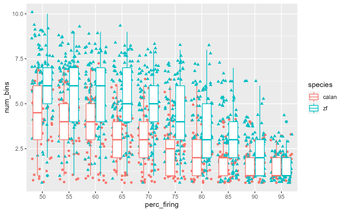
Swap colour to fill:
data_D %>%
  ggplot(aes(x = perc_firing, y = num_bins, fill = species)) +
    geom_point(aes(shape = species), position = 'jitter') +
    geom_boxplot()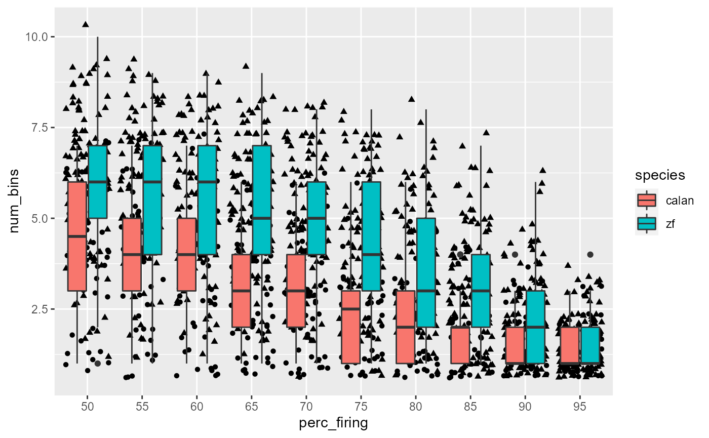
Fix colours:
# browseURL("http://www.sthda.com/english/wiki/ggplot2-point-shapes")
data_D %>%
  ggplot(aes(x = perc_firing, y = num_bins, fill = species)) +
    geom_point(aes(shape = species), position = 'jitter') +
    geom_boxplot() +
    scale_fill_manual(values = c(col_hb, col_zb)) +
    scale_shape_manual(values = c(24, 21))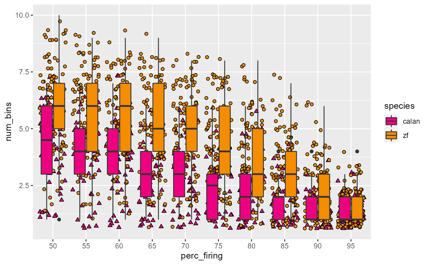
De-emphasize boxplots, remove outliers
data_D %>%
  ggplot(aes(x = perc_firing, y = num_bins, fill = species)) +
    geom_boxplot(alpha = 0.5, outlier.size = 0) +
    geom_point(aes(shape = species), position = 'jitter') +
    scale_fill_manual(values = c(col_hb, col_zb)) +
    scale_shape_manual(values = c(24, 21))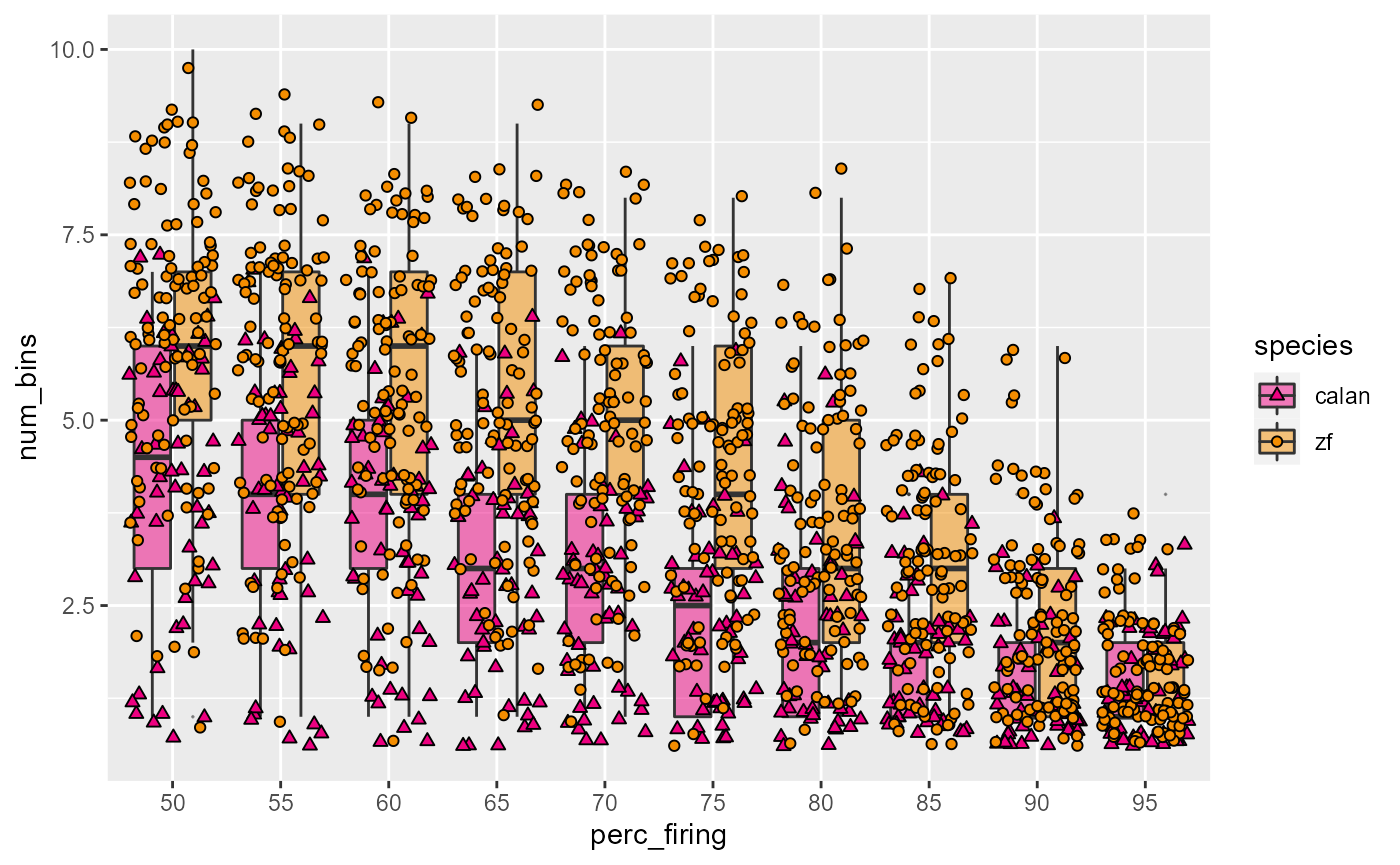
Tune jitter:
data_D %>%
  ggplot(aes(x = perc_firing, y = num_bins, fill = species)) +
    geom_boxplot(alpha = 0.5, outlier.size = 0) +
    geom_point(
      aes(shape = species),
      position = position_jitterdodge(jitter.height = 0.3,
                                      jitter.width = 0.2)
    ) +
    scale_fill_manual(values = c(col_hb, col_zb)) +
    scale_shape_manual(values = c(24, 21))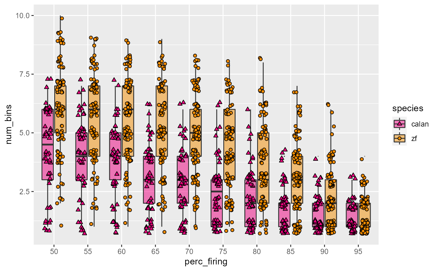
Titles and theming and save:
fig_D <- data_D %>%
  ggplot(aes(x = perc_firing, y = num_bins, fill = species)) +
    geom_boxplot(alpha = 0.5, outlier.size = 0) +
    geom_point(
      aes(shape = species),
      position = position_jitterdodge(jitter.height = 0.3,
                                      jitter.width = 0.2)
    ) +
    scale_fill_manual(values = c(col_hb, col_zb)) +
    scale_shape_manual(values = c(24, 21)) +
    labs(
      x = "Percent of maximum firing rate (threshold)",
      y = "Number of speed bins above threshold"
    ) +
    # theme_bw()
    # theme_light()
    # theme_dark()
    theme_classic()
fig_D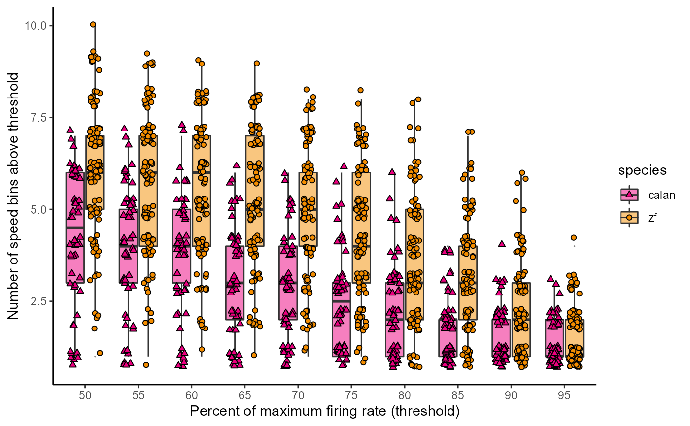
Let’s create a theme:
theme_548 <- theme_classic() +
    theme(
      axis.title = element_text(size = 13),
      axis.text = element_text(size = 13, colour = "black"),
      axis.line = element_blank()
    )
Let’s see what it looks like
fig_D + theme_548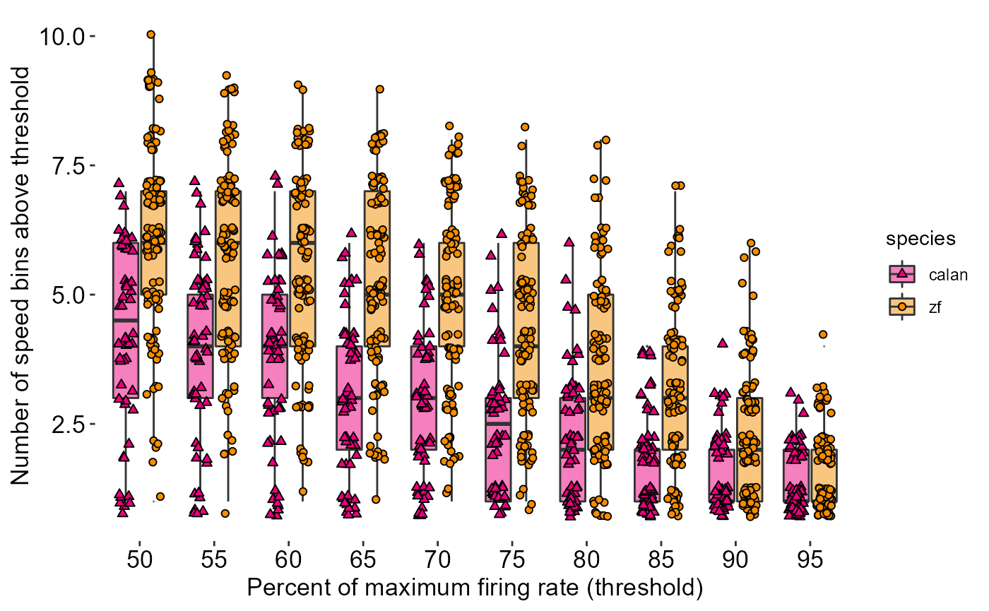
Let’s create a theme:
theme_548 <- theme_classic() +
    theme(
      # Text
      axis.title = element_text(size = 13),
      axis.text = element_text(size = 13, colour = "black"),
      axis.text.x = element_text(margin = margin(t = 10, unit = "pt")),
      axis.text.y = element_text(margin = margin(r = 10)),
      # Axis line
      axis.line = element_blank(),
      axis.ticks.length = unit(-5,"pt"),
      # Legend
      legend.position = 'none',
      # Background transparency
        # Background of panel
      panel.background = element_rect(fill = "transparent"),
        # Background behind actual data points
      plot.background = element_rect(fill = "transparent", color = NA)
    )

fig_D + theme_548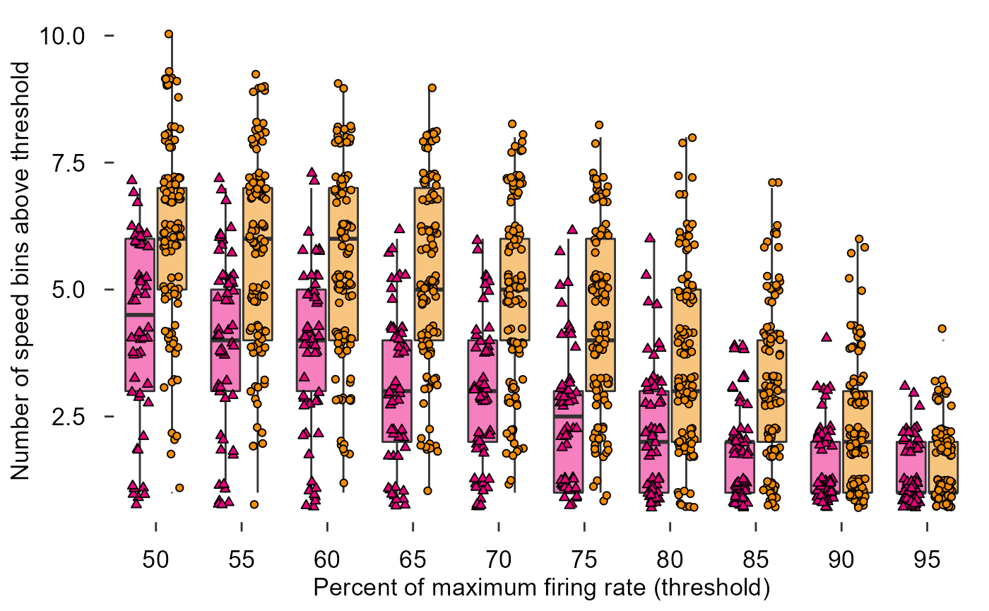
Draw in x and y axes:
data_D %>%
  ggplot(aes(x = perc_firing, y = num_bins, fill = species)) +
    geom_boxplot(alpha = 0.5, outlier.size = 0) +
    geom_point(
      aes(shape = species),
      position = position_jitterdodge(jitter.height = 0.3,
                                      jitter.width = 0.2)
    ) +
    scale_fill_manual(values = c(col_hb, col_zb)) +
    scale_shape_manual(values = c(24, 21)) +
    labs(
      x = "Percent of maximum firing rate (threshold)",
      y = "Number of speed bins above threshold"
    ) +
    theme_548 +
    ggthemes::geom_rangeframe()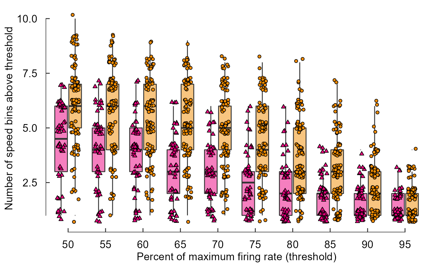
Draw in x and y axes:
fig_D <- data_D %>%
  ggplot(aes(x = perc_firing, y = num_bins, fill = species)) +
    geom_boxplot(alpha = 0.5, outlier.size = 0) +
    geom_point(
      aes(shape = species),
      position = position_jitterdodge(jitter.height = 0.3,
                                      jitter.width = 0.2)
    ) +
    scale_fill_manual(values = c(col_hb, col_zb)) +
    scale_shape_manual(values = c(24, 21)) +
    labs(
      x = "Percent of maximum firing rate (threshold)",
      y = "Number of speed bins above threshold"
    ) +
    theme_548 +
    geom_rangeframe() +
    annotate(geom = "segment", x = 0, xend = 0, y = 2.5, yend = 10)
fig_D
Build a grouped barplot (Figure 3 Panel E):
Visualize the data:
read_csv("./Fig3E_data.csv")
#> Rows: 3 Columns: 16
#> ── Column specification ────────────────────────────────────────────────────────
#> Delimiter: ","
#> dbl (16): 0.1, 0.24, 0.5, 1, 1.5, 2, 4, 8, 16, 24, 32, 48, 64, 80, 128, 256
#>
#> ℹ Use `spec()` to retrieve the full column specification for this data.
#> ℹ Specify the column types or set `show_col_types = FALSE` to quiet this message.
#> # A tibble: 3 × 16
#>   `0.1` `0.24`  `0.5`    `1`  `1.5`     `2`     `4`    `8`   `16`   `24`   `32`
#>   <dbl>  <dbl>  <dbl>  <dbl>  <dbl>   <dbl>   <dbl>  <dbl>  <dbl>  <dbl>  <dbl>
#> 1     0 0.0357 0.0179 0      0      0.107   0.0357  0.0357 0.0536 0.0893 0.0714
#> 2     0 0      0      0.0187 0      0.00935 0.00935 0.0935 0.168  0.121  0.187
#> 3     0 0      0.0947 0.0526 0.0105 0.126   0.126   0.0842 0.147  0      0.147
#> # … with 5 more variables: `48` <dbl>, `64` <dbl>, `80` <dbl>, `128` <dbl>,
#> #   `256` <dbl>
Restructure data for plotting:
# Add the missing info
read_csv("./Fig3E_data.csv") %>%
  mutate(species = c("hb", "zb", "pg"))
#> Rows: 3 Columns: 16
#> ── Column specification ────────────────────────────────────────────────────────
#> Delimiter: ","
#> dbl (16): 0.1, 0.24, 0.5, 1, 1.5, 2, 4, 8, 16, 24, 32, 48, 64, 80, 128, 256
#>
#> ℹ Use `spec()` to retrieve the full column specification for this data.
#> ℹ Specify the column types or set `show_col_types = FALSE` to quiet this message.
#> # A tibble: 3 × 17
#>   `0.1` `0.24`  `0.5`    `1`  `1.5`     `2`     `4`    `8`   `16`   `24`   `32`
#>   <dbl>  <dbl>  <dbl>  <dbl>  <dbl>   <dbl>   <dbl>  <dbl>  <dbl>  <dbl>  <dbl>
#> 1     0 0.0357 0.0179 0      0      0.107   0.0357  0.0357 0.0536 0.0893 0.0714
#> 2     0 0      0      0.0187 0      0.00935 0.00935 0.0935 0.168  0.121  0.187
#> 3     0 0      0.0947 0.0526 0.0105 0.126   0.126   0.0842 0.147  0      0.147
#> # … with 6 more variables: `48` <dbl>, `64` <dbl>, `80` <dbl>, `128` <dbl>,
#> #   `256` <dbl>, species <chr>

# Pull the y-values down from the header
data_E <- read_csv("./Fig3E_data.csv") %>%
  mutate(species = c("hb", "zb", "pg")) %>%
  pivot_longer(names_to = "speed", values_to = "prop", -species)
#> Rows: 3 Columns: 16
#> ── Column specification ────────────────────────────────────────────────────────
#> Delimiter: ","
#> dbl (16): 0.1, 0.24, 0.5, 1, 1.5, 2, 4, 8, 16, 24, 32, 48, 64, 80, 128, 256
#>
#> ℹ Use `spec()` to retrieve the full column specification for this data.
#> ℹ Specify the column types or set `show_col_types = FALSE` to quiet this message.
data_E
#> # A tibble: 48 × 3
#>    species speed   prop
#>    <chr>   <chr>  <dbl>
#>  1 hb      0.1   0
#>  2 hb      0.24  0.0357
#>  3 hb      0.5   0.0179
#>  4 hb      1     0
#>  5 hb      1.5   0
#>  6 hb      2     0.107
#>  7 hb      4     0.0357
#>  8 hb      8     0.0357
#>  9 hb      16    0.0536
#> 10 hb      24    0.0893
#> # … with 38 more rows
Plot data:
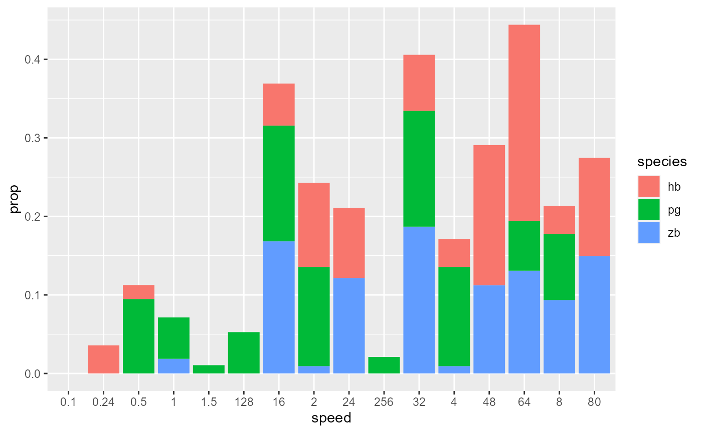
# But wait, the x-axis and species are out of order!
data_E
#> # A tibble: 48 × 3
#>    species speed   prop
#>    <chr>   <chr>  <dbl>
#>  1 hb      0.1   0
#>  2 hb      0.24  0.0357
#>  3 hb      0.5   0.0179
#>  4 hb      1     0
#>  5 hb      1.5   0
#>  6 hb      2     0.107
#>  7 hb      4     0.0357
#>  8 hb      8     0.0357
#>  9 hb      16    0.0536
#> 10 hb      24    0.0893
#> # … with 38 more rows

data_E <- data_E %>%
  mutate(
    species = fct_relevel(species, c("hb","zb","pg")),
    speed = as_factor(as.numeric(speed))
  )
data_E
#> # A tibble: 48 × 3
#>    species speed   prop
#>    <fct>   <fct>  <dbl>
#>  1 hb      0.1   0
#>  2 hb      0.24  0.0357
#>  3 hb      0.5   0.0179
#>  4 hb      1     0
#>  5 hb      1.5   0
#>  6 hb      2     0.107
#>  7 hb      4     0.0357
#>  8 hb      8     0.0357
#>  9 hb      16    0.0536
#> 10 hb      24    0.0893
#> # … with 38 more rows
Plot data again!
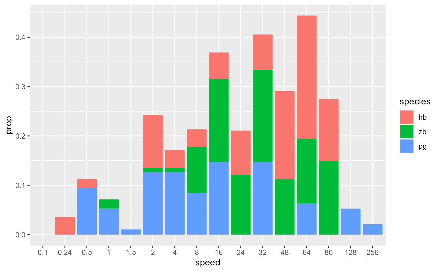
# Unstack columns and add black outline
data_E %>%
  ggplot(aes(x = speed, y = prop, fill = species)) +
    geom_col(position = 'dodge', colour = "black")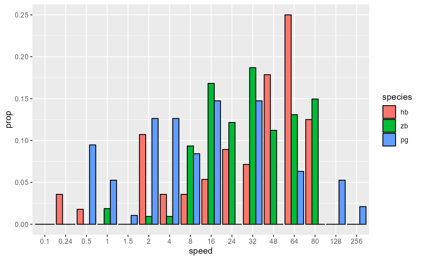
# Space out column groups, thin out the columns, thin the outline
data_E %>%
  ggplot(aes(x = speed, y = prop, fill = species)) +
    geom_col(
      position = position_dodge(0.75),
      width = 0.75,
      size = 0.2,
      colour = "black"
    )
Pick colours, add labels, add theme:
data_E %>%
  ggplot(aes(x = speed, y = prop, fill = species)) +
    geom_col(
      position = position_dodge(0.75),
      width = 0.75,
      size = 0.2,
      colour = "black"
    ) +
    scale_fill_manual(values = c(col_hb, col_zb, col_pg)) +
    labs(
      x = "Speed bins (degrees/s)",
      y = "Proportion of LM\ncell population"
    )+
    theme_548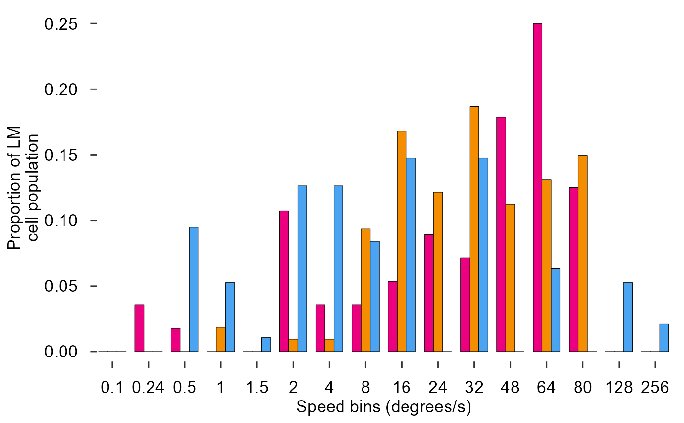
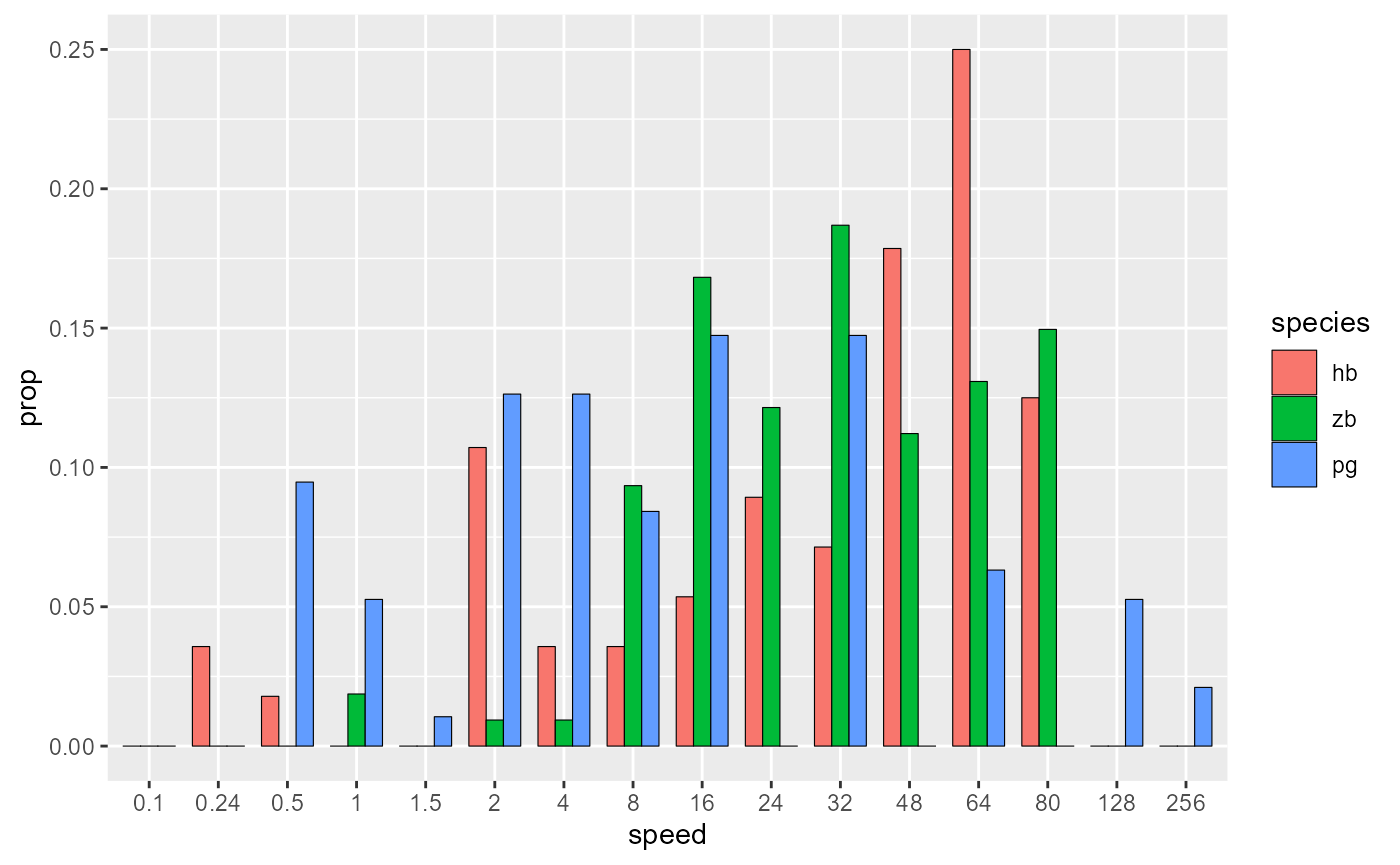
Fix x axis, add y axis line:
fig_E <- data_E %>%
  ggplot(aes(x = speed, y = prop, fill = species)) +
    # Plot data
    geom_col(
      position = position_dodge(0.75),
      width = 0.75,
      size = 0.2,
      colour = "black"
    ) +
    # Pick colours
    scale_fill_manual(values = c(col_hb, col_zb, col_pg)) +
    # Text
    labs(
      x = "Speed bins (degrees/s)",
      y = "Proportion of LM\ncell population"
    )+
    # Theme
    theme_548 +
    # Axes
    theme(
      axis.ticks.x = element_blank(),
      axis.text.x = element_text(margin = margin(t = 0))
    ) +
    geom_rangeframe(sides = 'l')
fig_E
Build a line plot with error bars and other graphical features (Figure 3 Panel B):
Visualize data:
read_csv("Fig3B_data.csv")
#> Rows: 239 Columns: 23
#> ── Column specification ────────────────────────────────────────────────────────
#> Delimiter: ","
#> dbl (23): trial, direction, speed, bin1, bin2, bin3, bin4, bin5, bin6, bin7,...
#>
#> ℹ Use `spec()` to retrieve the full column specification for this data.
#> ℹ Specify the column types or set `show_col_types = FALSE` to quiet this message.
#> # A tibble: 239 × 23
#>    trial direction    speed  bin1  bin2  bin3  bin4  bin5  bin6  bin7  bin8
#>    <dbl>     <dbl>    <dbl> <dbl> <dbl> <dbl> <dbl> <dbl> <dbl> <dbl> <dbl>
#>  1     1       135   1.90   12.0   4.00  4.00  0     4.00  0     0     0
#>  2     2       NaN NaN       0     4.00  0     4.00  0     0     0     0
#>  3     3       315  -0.696   0     4.00  0     0     0     0     4.00  0
#>  4     4       NaN NaN       0     0     0     0     0     4.00  0     0
#>  5     5       135  -0.0867  0     0     0     4.00  0     0     0     0
#>  6     6       NaN NaN       0     0     0     0     0     0     0     0
#>  7     7       135   0.821  16    24    16    28    36     8.00  8.00  8.00
#>  8     8       NaN NaN       4.00  0     0     0     0     0     0     0
#>  9     9       315   1.63    0     0     0     0     0     0     0     0
#> 10    10       NaN NaN       0     4.00 12     0     4.00  0     0     4.00
#> # … with 229 more rows, and 12 more variables: bin9 <dbl>, bin10 <dbl>,
#> #   bin11 <dbl>, bin12 <dbl>, bin13 <dbl>, bin14 <dbl>, bin15 <dbl>,
#> #   bin16 <dbl>, bin17 <dbl>, bin18 <dbl>, bin19 <dbl>, bin20 <dbl>
Gather all the bin data into one column:
read_csv("Fig3B_data.csv") %>%
  pivot_longer(names_to = "bin", values_to = "count", starts_with("bin"))
#> Rows: 239 Columns: 23
#> ── Column specification ────────────────────────────────────────────────────────
#> Delimiter: ","
#> dbl (23): trial, direction, speed, bin1, bin2, bin3, bin4, bin5, bin6, bin7,...
#>
#> ℹ Use `spec()` to retrieve the full column specification for this data.
#> ℹ Specify the column types or set `show_col_types = FALSE` to quiet this message.
#> # A tibble: 4,780 × 5
#>    trial direction speed bin   count
#>    <dbl>     <dbl> <dbl> <chr> <dbl>
#>  1     1       135  1.90 bin1  12.0
#>  2     1       135  1.90 bin2   4.00
#>  3     1       135  1.90 bin3   4.00
#>  4     1       135  1.90 bin4   0
#>  5     1       135  1.90 bin5   4.00
#>  6     1       135  1.90 bin6   0
#>  7     1       135  1.90 bin7   0
#>  8     1       135  1.90 bin8   0
#>  9     1       135  1.90 bin9   0
#> 10     1       135  1.90 bin10  4.00
#> # … with 4,770 more rows
Group the data by trial, direction speed:
read_csv("Fig3B_data.csv") %>%
  pivot_longer(names_to = "bin", values_to = "count", starts_with("bin")) %>%
  group_by(trial, direction, speed)
#> Rows: 239 Columns: 23
#> ── Column specification ────────────────────────────────────────────────────────
#> Delimiter: ","
#> dbl (23): trial, direction, speed, bin1, bin2, bin3, bin4, bin5, bin6, bin7,...
#>
#> ℹ Use `spec()` to retrieve the full column specification for this data.
#> ℹ Specify the column types or set `show_col_types = FALSE` to quiet this message.
#> # A tibble: 4,780 × 5
#> # Groups:   trial, direction, speed [239]
#>    trial direction speed bin   count
#>    <dbl>     <dbl> <dbl> <chr> <dbl>
#>  1     1       135  1.90 bin1  12.0
#>  2     1       135  1.90 bin2   4.00
#>  3     1       135  1.90 bin3   4.00
#>  4     1       135  1.90 bin4   0
#>  5     1       135  1.90 bin5   4.00
#>  6     1       135  1.90 bin6   0
#>  7     1       135  1.90 bin7   0
#>  8     1       135  1.90 bin8   0
#>  9     1       135  1.90 bin9   0
#> 10     1       135  1.90 bin10  4.00
#> # … with 4,770 more rows
Calculate firing rate for each trial:
read_csv("Fig3B_data.csv") %>%
  pivot_longer(names_to = "bin", values_to = "count", starts_with("bin")) %>%
  group_by(trial, direction, speed) %>%
  summarize(
    raw_firing_rate = mean(count)
  )
#> Rows: 239 Columns: 23
#> ── Column specification ────────────────────────────────────────────────────────
#> Delimiter: ","
#> dbl (23): trial, direction, speed, bin1, bin2, bin3, bin4, bin5, bin6, bin7,...
#>
#> ℹ Use `spec()` to retrieve the full column specification for this data.
#> ℹ Specify the column types or set `show_col_types = FALSE` to quiet this message.
#> `summarise()` has grouped output by 'trial', 'direction'. You can override using the `.groups` argument.
#> # A tibble: 239 × 4
#> # Groups:   trial, direction [239]
#>    trial direction    speed raw_firing_rate
#>    <dbl>     <dbl>    <dbl>           <dbl>
#>  1     1       135   1.90             2.00
#>  2     2       NaN NaN                0.400
#>  3     3       315  -0.696            0.800
#>  4     4       NaN NaN                0.400
#>  5     5       135  -0.0867           0.600
#>  6     6       NaN NaN                0
#>  7     7       135   0.821           11.4
#>  8     8       NaN NaN                0.200
#>  9     9       315   1.63             0
#> 10    10       NaN NaN                1.20
#> # … with 229 more rows
Finally let’s ungroup and store this unnormalized data:
data_B_raw <- read_csv("Fig3B_data.csv") %>%
  pivot_longer(names_to = "bin", values_to = "count", starts_with("bin")) %>%
  group_by(trial, direction, speed) %>%
  summarize(
    raw_firing_rate = mean(count)
  ) %>%
  ungroup()
#> Rows: 239 Columns: 23
#> ── Column specification ────────────────────────────────────────────────────────
#> Delimiter: ","
#> dbl (23): trial, direction, speed, bin1, bin2, bin3, bin4, bin5, bin6, bin7,...
#>
#> ℹ Use `spec()` to retrieve the full column specification for this data.
#> ℹ Specify the column types or set `show_col_types = FALSE` to quiet this message.
#> `summarise()` has grouped output by 'trial', 'direction'. You can override using the `.groups` argument.
data_B_raw
#> # A tibble: 239 × 4
#>    trial direction    speed raw_firing_rate
#>    <dbl>     <dbl>    <dbl>           <dbl>
#>  1     1       135   1.90             2.00
#>  2     2       NaN NaN                0.400
#>  3     3       315  -0.696            0.800
#>  4     4       NaN NaN                0.400
#>  5     5       135  -0.0867           0.600
#>  6     6       NaN NaN                0
#>  7     7       135   0.821           11.4
#>  8     8       NaN NaN                0.200
#>  9     9       315   1.63             0
#> 10    10       NaN NaN                1.20
#> # … with 229 more rows
Now we need to normalize the data:
# First calculate a baseline
tail(data_B_raw)
#> # A tibble: 6 × 4
#>   trial direction    speed raw_firing_rate
#>   <dbl>     <dbl>    <dbl>           <dbl>
#> 1   234       NaN NaN                0.400
#> 2   235       315  -0.0867           4.00
#> 3   236       NaN NaN                0
#> 4   237       135  -0.696            0.600
#> 5   238       NaN NaN                0.600
#> 6   239       315   0.821            0.200

data_B_raw %>%
  filter(direction == 'NaN')
#> # A tibble: 119 × 4
#>    trial direction speed raw_firing_rate
#>    <dbl>     <dbl> <dbl>           <dbl>
#>  1     2       NaN   NaN           0.400
#>  2     4       NaN   NaN           0.400
#>  3     6       NaN   NaN           0
#>  4     8       NaN   NaN           0.200
#>  5    10       NaN   NaN           1.20
#>  6    12       NaN   NaN           0.600
#>  7    14       NaN   NaN           0.800
#>  8    16       NaN   NaN           0.6
#>  9    18       NaN   NaN           0.200
#> 10    20       NaN   NaN           0.400
#> # … with 109 more rows

data_B_raw %>%
  filter(direction == 'NaN') %>%
  pull(raw_firing_rate)
#>   [1]  0.400010  0.400010  0.000000  0.200005  1.200015  0.600015  0.800020
#>   [8]  0.600000  0.200005  0.400010  0.200005  1.000020  4.600060  1.800045
#>  [15]  2.200045  0.000000 11.000040  1.200030  1.400035  0.400010  1.600010
#>  [22]  0.600030  0.000000  0.000000  0.000000  0.200005  0.000000  0.000000
#>  [29]  0.200005  0.400010  0.200005  0.000000  0.200005  0.200005  0.600015
#>  [36]  0.000000  0.000000  1.600035  3.600060  0.200005  0.200000  0.200005
#>  [43]  0.800020  0.000000  0.400010  0.200005  0.800020  0.800020  0.800020
#>  [50]  0.200005  0.200000  0.600015  0.200005  0.600015  0.600015  0.000000
#>  [57]  0.200005  0.000000  0.200005  0.000000  0.000000  0.000000  0.000000
#>  [64]  0.000000  0.200005  0.400005  1.400020  0.000000  0.000000  0.000000
#>  [71]  0.000000 12.800070  0.000000  0.000000  0.000000  0.000000  1.600070
#>  [78]  0.400010  4.200115  1.200015  0.000000  0.000000  0.000000  0.200005
#>  [85]  0.000000  0.400010  0.400010  0.400010  0.200005  1.400035  0.400010
#>  [92]  0.200005  0.000000  0.000000  0.000000  0.000000  0.000000  0.000000
#>  [99]  4.600050  0.200005  0.000000  0.400010  1.800045  0.600015  0.200005
#> [106]  0.000000  0.200005  0.200005  0.000000  0.000000  0.200005  0.000000
#> [113]  0.000000  0.200005  0.000000  0.400005  0.400010  0.000000  0.600015

baseline <- data_B_raw %>%
  filter(direction == 'NaN') %>%
  pull(raw_firing_rate) %>%
  mean
baseline
#> [1] 0.6806833

# Use the baseline to normalize the data
data_B_raw %>%
  filter(direction != 'NaN') %>%
  mutate(
    norm_firing_rate = raw_firing_rate - baseline,
    norm_firing_rate = norm_firing_rate / max(abs(norm_firing_rate))
  )
#> # A tibble: 120 × 5
#>    trial direction   speed raw_firing_rate norm_firing_rate
#>    <dbl>     <dbl>   <dbl>           <dbl>            <dbl>
#>  1     1       135  1.90             2.00           0.0676
#>  2     3       315 -0.696            0.800          0.00611
#>  3     5       135 -0.0867           0.600         -0.00413
#>  4     7       135  0.821           11.4            0.549
#>  5     9       315  1.63             0             -0.0349
#>  6    11       135 -0.401            0.200         -0.0246
#>  7    13       315  1.90             0             -0.0349
#>  8    15       135  1.63            20.2            1
#>  9    17       315 -0.0867           0.200         -0.0246
#> 10    19       135  1.13            13.2            0.641
#> # … with 110 more rows
Next let’s find the mean and SE of firing rate across like trials:
data_B_raw %>%
  filter(direction != 'NaN') %>%
  mutate(
    norm_firing_rate = raw_firing_rate - baseline,
    norm_firing_rate = norm_firing_rate / max(abs(norm_firing_rate))
  ) %>%
  group_by(direction, speed) %>%
  summarize(
    firing_rate = mean(norm_firing_rate),
    sem = sd(norm_firing_rate) / sqrt(n())
  )
#> `summarise()` has grouped output by 'direction'. You can override using the
#> `.groups` argument.
#> # A tibble: 24 × 4
#> # Groups:   direction [2]
#>    direction   speed firing_rate     sem
#>        <dbl>   <dbl>       <dbl>   <dbl>
#>  1       135 -0.696      -0.0185 0.00832
#>  2       135 -0.401      -0.0246 0.00561
#>  3       135 -0.0867     -0.0164 0.00753
#>  4       135  0.214      -0.0103 0.0132
#>  5       135  0.524       0.0287 0.0252
#>  6       135  0.821       0.148  0.101
#>  7       135  1.13        0.412  0.0661
#>  8       135  1.30        0.578  0.0902
#>  9       135  1.43        0.654  0.0572
#> 10       135  1.63        0.717  0.0812
#> # … with 14 more rows
Finally ungroup the data and convert direction to a factor:
data_B <- data_B_raw %>%
  filter(direction != 'NaN') %>%
  mutate(
    norm_firing_rate = raw_firing_rate - baseline,
    norm_firing_rate = norm_firing_rate / max(abs(norm_firing_rate))
  ) %>%
  group_by(direction, speed) %>%
  summarize(
    firing_rate = mean(norm_firing_rate),
    sem = sd(norm_firing_rate) / sqrt(n())
  ) %>%
  ungroup() %>%
  mutate(direction = as_factor(direction))
#> `summarise()` has grouped output by 'direction'. You can override using the
#> `.groups` argument.
data_B
#> # A tibble: 24 × 4
#>    direction   speed firing_rate     sem
#>    <fct>       <dbl>       <dbl>   <dbl>
#>  1 135       -0.696      -0.0185 0.00832
#>  2 135       -0.401      -0.0246 0.00561
#>  3 135       -0.0867     -0.0164 0.00753
#>  4 135        0.214      -0.0103 0.0132
#>  5 135        0.524       0.0287 0.0252
#>  6 135        0.821       0.148  0.101
#>  7 135        1.13        0.412  0.0661
#>  8 135        1.30        0.578  0.0902
#>  9 135        1.43        0.654  0.0572
#> 10 135        1.63        0.717  0.0812
#> # … with 14 more rows
Plot the data!
data_B %>%
  ggplot(aes(x = speed, y = firing_rate)) +
    geom_point(aes(colour = direction, shape = direction)) +
    geom_line(aes(colour = direction))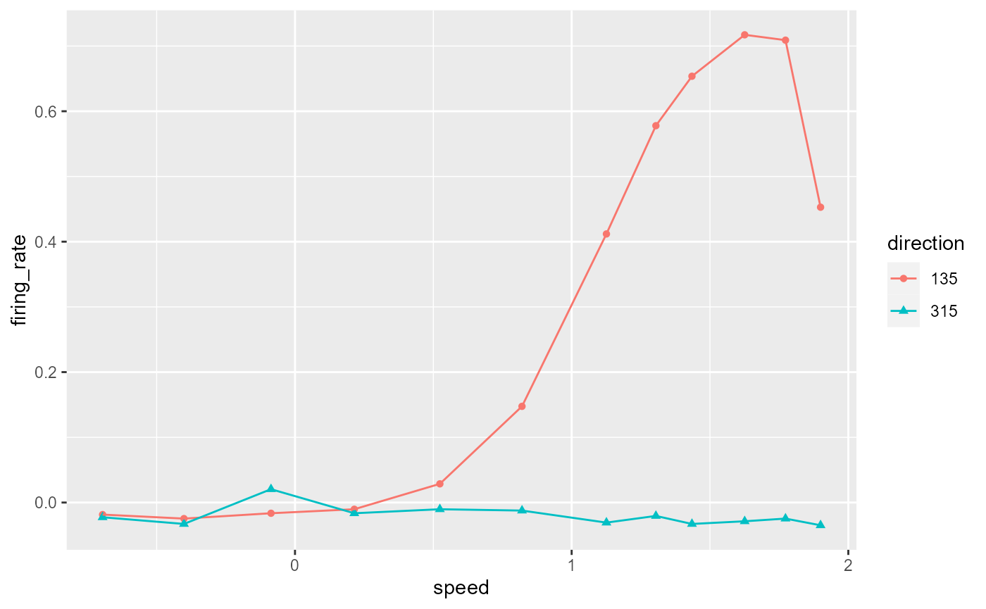
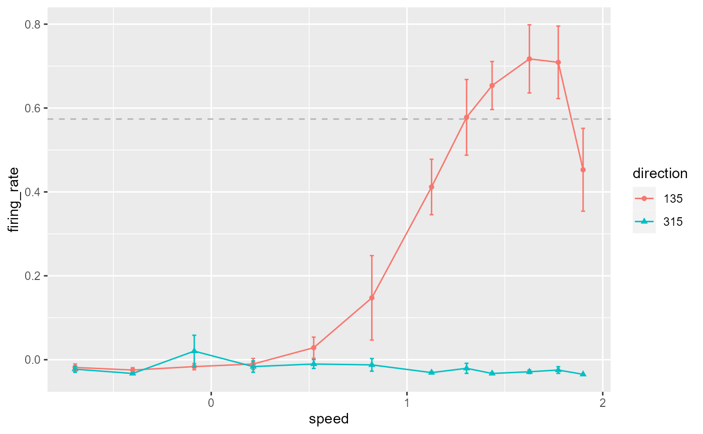
Add error bars and threshold line:
data_B %>%
  ggplot(aes(x = speed, y = firing_rate)) +
    geom_point(aes(colour = direction, shape = direction)) +
    geom_line(aes(colour = direction)) +
    geom_errorbar(
      aes(
        colour = direction,
        ymin = firing_rate - sem,
        ymax = firing_rate + sem
      ),
      width = 0.02
    ) +
    geom_hline(
      yintercept = 0.8 * max(data_B$firing_rate),
      colour = 'grey70',
      linetype = 'dashed'
    )
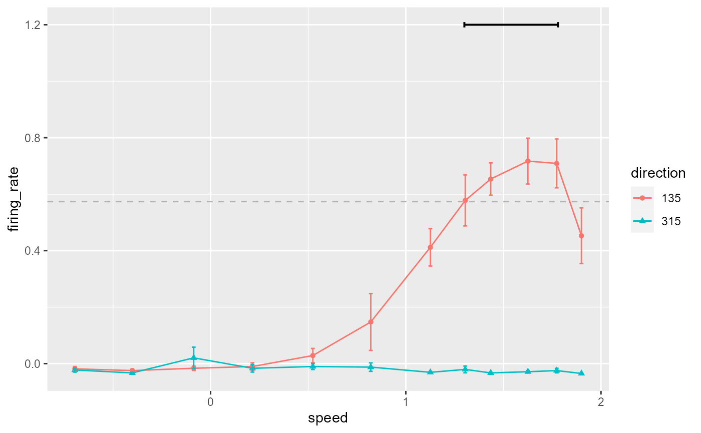
Add a line segment indicating points over threshold:
data_B %>%
  ggplot(aes(x = speed, y = firing_rate)) +
    geom_point(aes(colour = direction, shape = direction)) +
    geom_line(aes(colour = direction)) +
    geom_errorbar(
      aes(
        colour = direction,
        ymin = firing_rate - sem,
        ymax = firing_rate + sem
      ),
      width = 0.02
    ) +
    geom_hline(
      yintercept = 0.8 * max(data_B$firing_rate),
      colour = 'grey70',
      linetype = 'dashed'
    ) +
    annotate(
      geom = 'segment',
      x = 1.3,
      xend = 1.78,
      y = 1.2,
      yend = 1.2,
      size = 0.7,
      arrow = arrow(ends = 'both', length = unit(2, "pt"), angle = 90)
    )
Set colours, shapes, labels, and themes:
data_B %>%
  ggplot(aes(x = speed, y = firing_rate)) +
    geom_point(aes(colour = direction, shape = direction)) +
    geom_line(aes(colour = direction)) +
    geom_errorbar(
      aes(
        colour = direction,
        ymin = firing_rate - sem,
        ymax = firing_rate + sem
      ),
      width = 0.02
    ) +
    geom_hline(
      yintercept = 0.8 * max(data_B$firing_rate),
      colour = 'grey70',
      linetype = 'dashed'
    ) +
    annotate(
      geom = 'segment',
      x = 1.3, xend = 1.78,
      y = 1.2, yend = 1.2,
      size = 0.7,
      arrow = arrow(ends = 'both', length = unit(2, "pt"), angle = 90)
    ) +
    scale_colour_manual(values = c("black", "grey50")) +
    scale_shape_manual(values = c(15, 18)) +
    labs(y = "Normalized\nfiring rate", x = "") +
    theme_548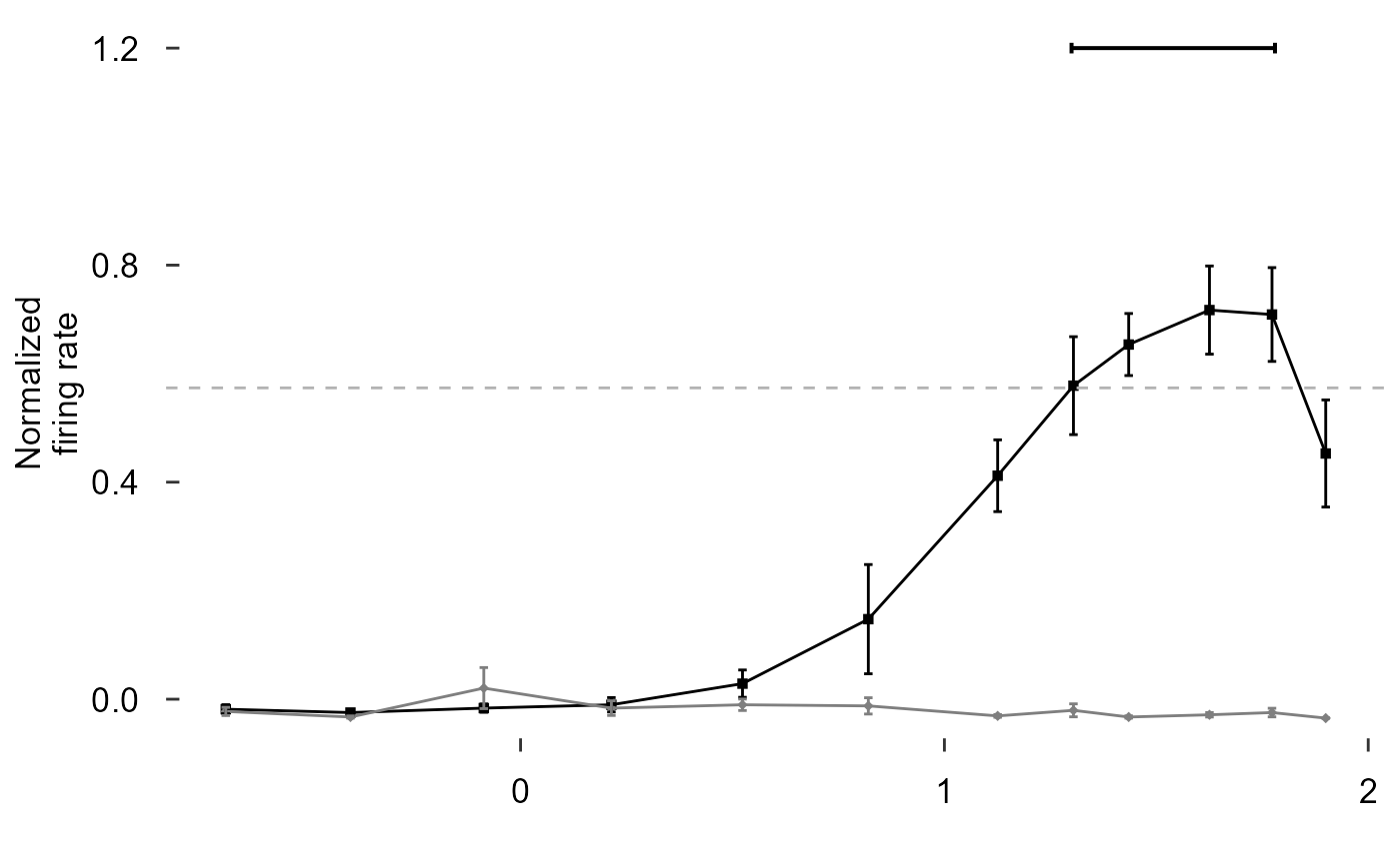
Make the diamonds bigger, reorder layers to emphasize points, remove x axis title:
data_B %>%
  ggplot(aes(x = speed, y = firing_rate)) +
    geom_hline(
      yintercept = 0.8 * max(data_B$firing_rate),
      colour = 'grey70',
      linetype = 'dashed'
    ) +
    geom_line(aes(colour = direction)) +
    geom_errorbar(
      aes(
        colour = direction,
        ymin = firing_rate - sem,
        ymax = firing_rate + sem
      ),
      width = 0.02
    ) +
    geom_point(aes(colour = direction, shape = direction, size = direction)) +
    annotate(
      geom = 'segment',
      x = 1.3, xend = 1.78,
      y = 1.2, yend = 1.2,
      size = 0.7,
      arrow = arrow(ends = 'both', length = unit(2, "pt"), angle = 90)
    ) +
    scale_colour_manual(values = c("black", "grey50")) +
    scale_shape_manual(values = c(15, 18)) +
    scale_size_manual(values = c(2, 3)) +
    labs(y = "Normalized\nfiring rate", x = "") +
    theme(axis.title.x = element_blank()) +
    theme_548
Add axis lines:
data_B %>%
  ggplot(aes(x = speed, y = firing_rate)) +
    geom_hline(
      yintercept = 0.8 * max(data_B$firing_rate),
      colour = 'grey70',
      linetype = 'dashed'
    ) +
    geom_line(aes(colour = direction)) +
    geom_errorbar(
      aes(
        colour = direction,
        ymin = firing_rate - sem,
        ymax = firing_rate + sem
      ),
      width = 0.02
    ) +
    geom_point(aes(colour = direction, shape = direction, size = direction)) +
    annotate(
      geom = 'segment',
      x = 1.3, xend = 1.78,
      y = 1.2, yend = 1.2,
      size = 0.7,
      arrow = arrow(ends = 'both', length = unit(2, "pt"), angle = 90)
    ) +
    scale_colour_manual(values = c("black", "grey50")) +
    scale_shape_manual(values = c(15, 18)) +
    scale_size_manual(values = c(2, 3)) +
    labs(y = "Normalized\nfiring rate", x = "") +
    theme(axis.title.x = element_blank()) +
    theme_548 +
    geom_rangeframe()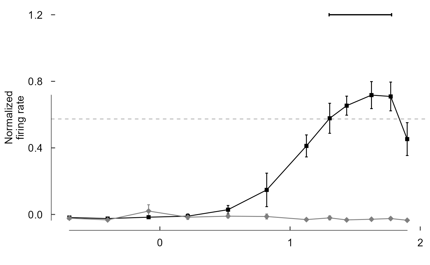
Note the line lengths, y limits, and x breaks are all
wrong
To fudge the lines, let’s make another dataset:
fudge_axis_BC <- tibble(speed = c(-0.5,2), firing_rate = c(-1,2))
fudge_axis_BC
#> # A tibble: 2 × 2
#>   speed firing_rate
#>   <dbl>       <dbl>
#> 1  -0.5          -1
#> 2   2             2

fig_B <- data_B %>%
  ggplot(aes(x = speed, y = firing_rate)) +
    # Plot data and threshold
    geom_hline(
      yintercept = 0.8 * max(data_B$firing_rate),
      colour = 'grey70',
      linetype = 'dashed'
    ) +
    geom_line(aes(colour = direction)) +
    geom_errorbar(
      aes(
        colour = direction,
        ymin = firing_rate - sem,
        ymax = firing_rate + sem
      ),
      width = 0.02
    ) +
    geom_point(aes(colour = direction, shape = direction, size = direction)) +
    # Annotate points over threshold
    annotate(
      geom = 'segment',
      x = 1.3, xend = 1.78,
      y = 1.2, yend = 1.2,
      size = 0.7,
      arrow = arrow(ends = 'both', length = unit(2, "pt"), angle = 90)
    ) +
    # Select colours and shapes
    scale_colour_manual(values = c("black", "grey50")) +
    scale_shape_manual(values = c(15, 18)) +
    scale_size_manual(values = c(2, 3)) +
    # Text
    labs(y = "Normalized\nfiring rate", x = "") +
    # Theme
    theme_548 +
    # Axes
    geom_rangeframe(data = fudge_axis_BC) +
    lims(y = c(-1,2)) +
    scale_x_continuous(breaks = -1:4 / 2)
fig_B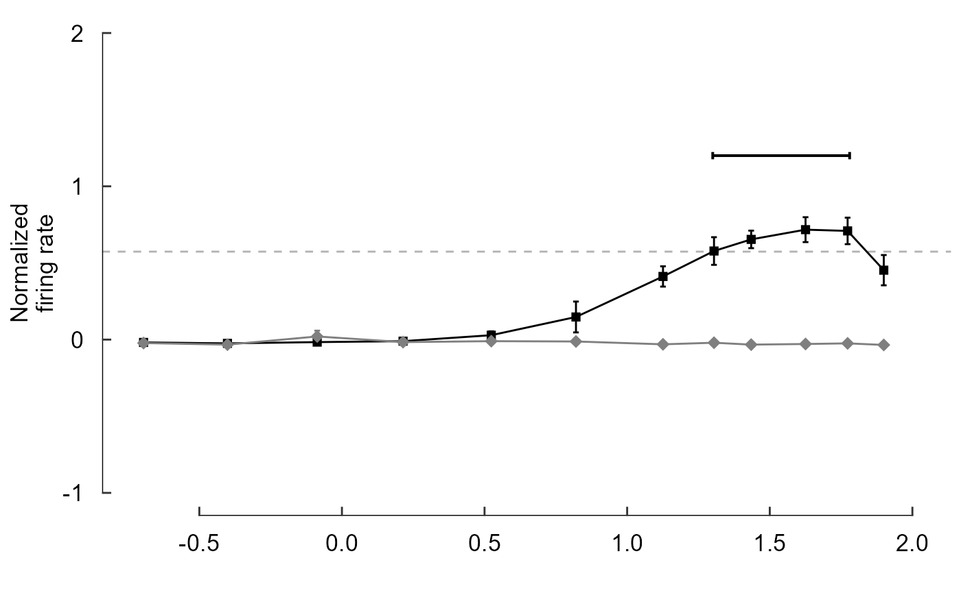
Build another grouped barplot (Figure 3 Panel F):
Visualize data:
read_csv("./Fig3F_data.csv")
#> Rows: 240 Columns: 33
#> ── Column specification ────────────────────────────────────────────────────────
#> Delimiter: ","
#> dbl (33): bird, trk, site, cell, pd.sum, species, test.dir1, dir1.area, test...
#>
#> ℹ Use `spec()` to retrieve the full column specification for this data.
#> ℹ Specify the column types or set `show_col_types = FALSE` to quiet this message.
#> # A tibble: 240 × 33
#>     bird   trk  site  cell pd.sum species test.dir1 dir1.area test.dir2
#>    <dbl> <dbl> <dbl> <dbl>  <dbl>   <dbl>     <dbl>     <dbl>     <dbl>
#>  1   194     1  3007     1   11.1       2         0      25.1       180
#>  2   194     1  3007     2  343.        2         0      41.4       180
#>  3   194     1  3062     1  298.        2        NA      NA          NA
#>  4   194     1  3062     2  358.        2         0      46.9       180
#>  5   194     1  3062     3  287.        2        NA      NA          NA
#>  6   194     3  3459     3  188.        2        NA      NA          NA
#>  7   194     5  3516     1  117.        2       135      20.9       315
#>  8   194     5  3516     2  176.        2       135      20.2       315
#>  9   194     5  3516     3  192.        2        NA      NA          NA
#> 10   194     5  3516     4  155.        2        NA      NA          NA
#> # … with 230 more rows, and 24 more variables: dir2.area <dbl>,
#> #   pref.speed <dbl>, sp80.1 <dbl>, sp80.2 <dbl>, sp80.3 <dbl>, sp80.4 <dbl>,
#> #   sp80.5 <dbl>, sp80.6 <dbl>, sp80.7 <dbl>, sp80.8 <dbl>, sp80.9 <dbl>,
#> #   sp80.10 <dbl>, sp80.11 <dbl>, sp80.12 <dbl>, tune50 <dbl>, tune55 <dbl>,
#> #   tune60 <dbl>, tune65 <dbl>, tune70 <dbl>, tune75 <dbl>, tune80 <dbl>,
#> #   tune85 <dbl>, tune90 <dbl>, tune95 <dbl>
speeds_F <- c(0.24,0.5,1,2,4,8,16,24,32,48,64,80)
Remove any rows without data (dir1.area is NA):
read_csv("./Fig3F_data.csv") %>%
  filter(!is.na(dir1.area))
#> Rows: 240 Columns: 33
#> ── Column specification ────────────────────────────────────────────────────────
#> Delimiter: ","
#> dbl (33): bird, trk, site, cell, pd.sum, species, test.dir1, dir1.area, test...
#>
#> ℹ Use `spec()` to retrieve the full column specification for this data.
#> ℹ Specify the column types or set `show_col_types = FALSE` to quiet this message.
#> # A tibble: 163 × 33
#>     bird   trk  site  cell pd.sum species test.dir1 dir1.area test.dir2
#>    <dbl> <dbl> <dbl> <dbl>  <dbl>   <dbl>     <dbl>     <dbl>     <dbl>
#>  1   194     1  3007     1   11.1       2         0     25.1        180
#>  2   194     1  3007     2  343.        2         0     41.4        180
#>  3   194     1  3062     2  358.        2         0     46.9        180
#>  4   194     5  3516     1  117.        2       135     20.9        315
#>  5   194     5  3516     2  176.        2       135     20.2        315
#>  6   198     3  2990     1  320.        2       315    -12.9        135
#>  7   198     3  2990     2  340.        2       315     30.4        135
#>  8   198     5  3345     2  147.        2       135     -2.81       315
#>  9   198     5  3345     3  141.        2       135    -22.7        315
#> 10   199     1  2383     1   92.4       2        90      1.67       270
#> # … with 153 more rows, and 24 more variables: dir2.area <dbl>,
#> #   pref.speed <dbl>, sp80.1 <dbl>, sp80.2 <dbl>, sp80.3 <dbl>, sp80.4 <dbl>,
#> #   sp80.5 <dbl>, sp80.6 <dbl>, sp80.7 <dbl>, sp80.8 <dbl>, sp80.9 <dbl>,
#> #   sp80.10 <dbl>, sp80.11 <dbl>, sp80.12 <dbl>, tune50 <dbl>, tune55 <dbl>,
#> #   tune60 <dbl>, tune65 <dbl>, tune70 <dbl>, tune75 <dbl>, tune80 <dbl>,
#> #   tune85 <dbl>, tune90 <dbl>, tune95 <dbl>
Remove unnecessary columns:
read_csv("./Fig3F_data.csv") %>%
  filter(!is.na(dir1.area))  %>%
  select(starts_with("sp"))
#> Rows: 240 Columns: 33
#> ── Column specification ────────────────────────────────────────────────────────
#> Delimiter: ","
#> dbl (33): bird, trk, site, cell, pd.sum, species, test.dir1, dir1.area, test...
#>
#> ℹ Use `spec()` to retrieve the full column specification for this data.
#> ℹ Specify the column types or set `show_col_types = FALSE` to quiet this message.
#> # A tibble: 163 × 13
#>    species sp80.1 sp80.2 sp80.3 sp80.4 sp80.5 sp80.6 sp80.7 sp80.8 sp80.9
#>      <dbl>  <dbl>  <dbl>  <dbl>  <dbl>  <dbl>  <dbl>  <dbl>  <dbl>  <dbl>
#>  1       2      0      0      0      0      0      0      0      0      0
#>  2       2      0      0      0      0      0      0      0      0      1
#>  3       2      0      0      0      0      0      0      0      0      1
#>  4       2      0      0      0      0      0      0      0      0      0
#>  5       2      0      0      0      0      1      0      0      0      0
#>  6       2      0      0      0      1      0      0      0      0      0
#>  7       2      0      0      0      0      0      0      0      0      0
#>  8       2      0      0      0      0      0      0      0      0      0
#>  9       2      1      0      0      0      0      0      0      0      0
#> 10       2      0      1      0      0      0      0      0      0      0
#> # … with 153 more rows, and 3 more variables: sp80.10 <dbl>, sp80.11 <dbl>,
#> #   sp80.12 <dbl>
Rename columns using speeds_F, change species to words:
read_csv("./Fig3F_data.csv") %>%
  filter(!is.na(dir1.area))  %>%
  select(starts_with("sp")) %>%
  rename_all(~c("species",as.character(speeds_F))) %>%
  mutate(
    species = case_when(
      species == 1 ~ "zb",
      species == 2 ~ "hb"
    )
  )
#> Rows: 240 Columns: 33
#> ── Column specification ────────────────────────────────────────────────────────
#> Delimiter: ","
#> dbl (33): bird, trk, site, cell, pd.sum, species, test.dir1, dir1.area, test...
#>
#> ℹ Use `spec()` to retrieve the full column specification for this data.
#> ℹ Specify the column types or set `show_col_types = FALSE` to quiet this message.
#> # A tibble: 163 × 13
#>    species `0.24` `0.5`   `1`   `2`   `4`   `8`  `16`  `24`  `32`  `48`  `64`
#>    <chr>    <dbl> <dbl> <dbl> <dbl> <dbl> <dbl> <dbl> <dbl> <dbl> <dbl> <dbl>
#>  1 hb           0     0     0     0     0     0     0     0     0     1     0
#>  2 hb           0     0     0     0     0     0     0     0     1     1     1
#>  3 hb           0     0     0     0     0     0     0     0     1     0     1
#>  4 hb           0     0     0     0     0     0     0     0     0     1     1
#>  5 hb           0     0     0     0     1     0     0     0     0     1     0
#>  6 hb           0     0     0     1     0     0     0     0     0     0     0
#>  7 hb           0     0     0     0     0     0     0     0     0     0     1
#>  8 hb           0     0     0     0     0     0     0     0     0     0     1
#>  9 hb           1     0     0     0     0     0     0     0     0     0     0
#> 10 hb           0     1     0     0     0     0     0     0     0     0     0
#> # … with 153 more rows, and 1 more variable: `80` <dbl>
Reshape data for plotting:
read_csv("./Fig3F_data.csv") %>%
  filter(!is.na(dir1.area))  %>%
  select(starts_with("sp")) %>%
  rename_all(~c("species",as.character(speeds_F))) %>%
  mutate(
    species = case_when(
      species == 1 ~ "zb",
      species == 2 ~ "hb"
    )
  ) %>%
  pivot_longer(names_to = "speed", values_to = "prop", -species)
#> Rows: 240 Columns: 33
#> ── Column specification ────────────────────────────────────────────────────────
#> Delimiter: ","
#> dbl (33): bird, trk, site, cell, pd.sum, species, test.dir1, dir1.area, test...
#>
#> ℹ Use `spec()` to retrieve the full column specification for this data.
#> ℹ Specify the column types or set `show_col_types = FALSE` to quiet this message.
#> # A tibble: 1,956 × 3
#>    species speed  prop
#>    <chr>   <chr> <dbl>
#>  1 hb      0.24      0
#>  2 hb      0.5       0
#>  3 hb      1         0
#>  4 hb      2         0
#>  5 hb      4         0
#>  6 hb      8         0
#>  7 hb      16        0
#>  8 hb      24        0
#>  9 hb      32        0
#> 10 hb      48        1
#> # … with 1,946 more rows
Summarize proportions by species and speed:
read_csv("./Fig3F_data.csv") %>%
  filter(!is.na(dir1.area))  %>%
  select(starts_with("sp")) %>%
  rename_all(~c("species",as.character(speeds_F))) %>%
  mutate(
    species = case_when(
      species == 1 ~ "zb",
      species == 2 ~ "hb"
    )
  ) %>%
  pivot_longer(names_to = "speed", values_to = "prop", -species) %>%
  group_by(species, speed) %>%
  summarise(prop = mean(prop)) %>%
  ungroup
#> Rows: 240 Columns: 33
#> ── Column specification ────────────────────────────────────────────────────────
#> Delimiter: ","
#> dbl (33): bird, trk, site, cell, pd.sum, species, test.dir1, dir1.area, test...
#>
#> ℹ Use `spec()` to retrieve the full column specification for this data.
#> ℹ Specify the column types or set `show_col_types = FALSE` to quiet this message.
#> `summarise()` has grouped output by 'species'. You can override using the `.groups` argument.
#> # A tibble: 24 × 3
#>    species speed   prop
#>    <chr>   <chr>  <dbl>
#>  1 hb      0.24  0.0357
#>  2 hb      0.5   0.0179
#>  3 hb      1     0
#>  4 hb      16    0.143
#>  5 hb      2     0.125
#>  6 hb      24    0.232
#>  7 hb      32    0.339
#>  8 hb      4     0.0357
#>  9 hb      48    0.446
#> 10 hb      64    0.5
#> # … with 14 more rows
Finally fix the factor levels as before:
data_F <- read_csv("./Fig3F_data.csv") %>%
  filter(!is.na(dir1.area))  %>%
  select(starts_with("sp")) %>%
  rename_all(~c("species",as.character(speeds_F))) %>%
  mutate(
    species = case_when(
      species == 1 ~ "zb",
      species == 2 ~ "hb"
    )
  ) %>%
  pivot_longer(names_to = "speed", values_to = "prop", -species) %>%
  group_by(species, speed) %>%
  summarise(prop = mean(prop)) %>%
  ungroup %>%
  mutate(
    species = fct_relevel(species, c('hb', 'zb')),
    speed = as_factor(as.numeric(speed))
  )
#> Rows: 240 Columns: 33
#> ── Column specification ────────────────────────────────────────────────────────
#> Delimiter: ","
#> dbl (33): bird, trk, site, cell, pd.sum, species, test.dir1, dir1.area, test...
#>
#> ℹ Use `spec()` to retrieve the full column specification for this data.
#> ℹ Specify the column types or set `show_col_types = FALSE` to quiet this message.
#> `summarise()` has grouped output by 'species'. You can override using the `.groups` argument.
data_F
#> # A tibble: 24 × 3
#>    species speed   prop
#>    <fct>   <fct>  <dbl>
#>  1 hb      0.24  0.0357
#>  2 hb      0.5   0.0179
#>  3 hb      1     0
#>  4 hb      16    0.143
#>  5 hb      2     0.125
#>  6 hb      24    0.232
#>  7 hb      32    0.339
#>  8 hb      4     0.0357
#>  9 hb      48    0.446
#> 10 hb      64    0.5
#> # … with 14 more rows
Plot data as before:
fig_F <- data_F %>%
  ggplot(aes(x = speed, y = prop, fill = species)) +
    # Plot data
    geom_col(
      position = position_dodge(0.75),
      width = 0.75,
      size = 0.2,
      colour = "black"
    ) +
    # Pick colours
    scale_fill_manual(values = c(col_hb, col_zb)) +
    # Text
    labs(
      x = "Speed bins (degrees/s)",
      y = "Proportion of LM\ncell population"
    ) +
    # Theme
    theme_548 +
    # Axes
    theme(
      axis.ticks.x = element_blank(),
      axis.text.x = element_text(margin = margin(t = 0))
    ) +
    geom_rangeframe(sides = 'l')
fig_F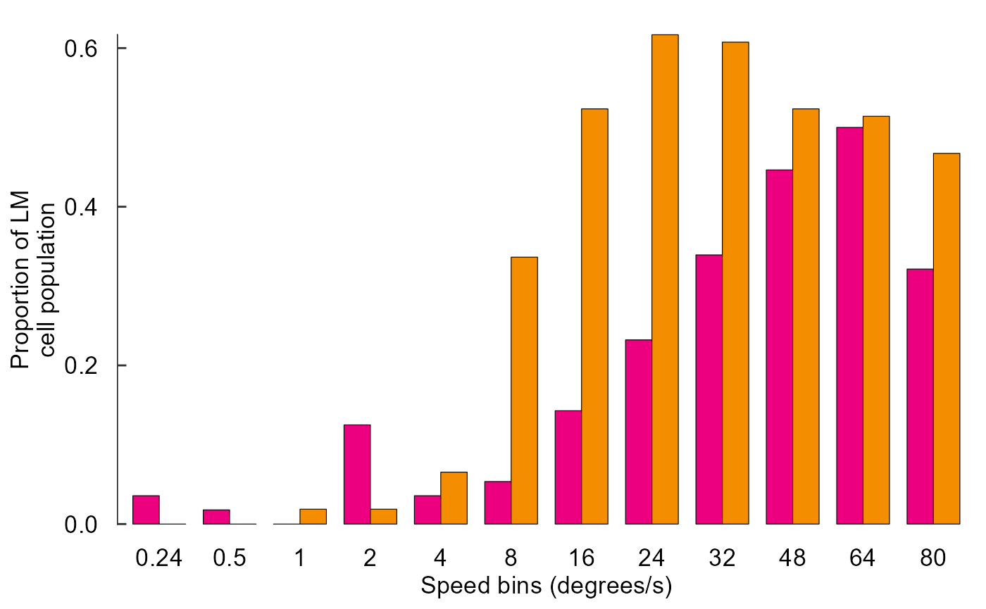
Build another line plot (Figure 3 Panel C):
Reorganize raw data:
data_C_raw <- read_csv("Fig3C_data.csv") %>%
  pivot_longer(names_to = "bin", values_to = "count", starts_with("bin")) %>%
  group_by(trial, direction, speed) %>%
  summarize(
    raw_firing_rate = mean(count)
  ) %>%
  ungroup()
#> Rows: 239 Columns: 23
#> ── Column specification ────────────────────────────────────────────────────────
#> Delimiter: ","
#> dbl (23): trial, direction, speed, bin1, bin2, bin3, bin4, bin5, bin6, bin7,...
#>
#> ℹ Use `spec()` to retrieve the full column specification for this data.
#> ℹ Specify the column types or set `show_col_types = FALSE` to quiet this message.
#> `summarise()` has grouped output by 'trial', 'direction'. You can override using the `.groups` argument.
data_C_raw
#> # A tibble: 239 × 4
#>    trial direction   speed raw_firing_rate
#>    <dbl>     <dbl>   <dbl>           <dbl>
#>  1     1       180   0.821            7.99
#>  2     2       NaN NaN                5.20
#>  3     3         0   1.30            24.8
#>  4     4       NaN NaN                2.80
#>  5     5       180   1.77             3.00
#>  6     6       NaN NaN                4.00
#>  7     7         0   0.214           14.8
#>  8     8       NaN NaN                2.80
#>  9     9       180   1.63             3.00
#> 10    10       NaN NaN                4.60
#> # … with 229 more rows
Calculate baseline:
baseline <- data_C_raw %>%
  filter(direction == 'NaN') %>%
  pull(raw_firing_rate) %>%
  mean
baseline
#> [1] 3.852074
Normalize data and calculate mean, SE:
data_C <- data_C_raw %>%
  filter(direction != 'NaN') %>%
  mutate(
    norm_firing_rate = raw_firing_rate - baseline,
    norm_firing_rate = norm_firing_rate / max(abs(norm_firing_rate))
  ) %>%
  group_by(direction, speed) %>%
  summarize(
    firing_rate = mean(norm_firing_rate),
    sem = sd(norm_firing_rate) / sqrt(n())
  ) %>%
  ungroup() %>%
  mutate(direction = as_factor(direction))
#> `summarise()` has grouped output by 'direction'. You can override using the
#> `.groups` argument.
data_C
#> # A tibble: 24 × 4
#>    direction   speed firing_rate     sem
#>    <fct>       <dbl>       <dbl>   <dbl>
#>  1 0         -0.696      -0.0109 0.0164
#>  2 0         -0.401       0.0133 0.00324
#>  3 0         -0.0867      0.138  0.0561
#>  4 0          0.214       0.475  0.100
#>  5 0          0.524       0.734  0.0500
#>  6 0          0.821       0.872  0.0443
#>  7 0          1.13        0.810  0.0794
#>  8 0          1.30        0.746  0.0507
#>  9 0          1.43        0.811  0.0452
#> 10 0          1.63        0.772  0.0796
#> # … with 14 more rows
Plot data:
fig_C <- data_C %>%
  ggplot(aes(x = speed, y = firing_rate)) +
    # Plot data and threshold
    geom_hline(
      yintercept = 0.8 * max(data_C$firing_rate),
      colour = 'grey70', linetype = 'dashed'
    ) +
    geom_line(aes(colour = direction)) +
    geom_errorbar(
      aes(
        colour = direction,
        ymin = firing_rate - sem,
        ymax = firing_rate + sem
      ),
      width = 0.02
    ) +
    geom_point(aes(colour = direction,
                   shape = direction,
                   size = direction)) +
    # Annotate points over threshold
    annotate(
      geom = "segment",
      x = 0.5, xend = 1.9,
      y = 1.2, yend = 1.2,
      size = 0.7,
      arrow = arrow(ends = 'both', length = unit(2, "pt"), angle = 90)
    ) +
    # Select colours and shapes
    scale_colour_manual(values = c("black", "grey50")) +
    scale_shape_manual(values = c(15, 18)) +
    scale_size_manual(values = c(2, 3)) +
    # Text
    labs(y = "Normalized\nfiring rate", x = "log(degrees/s)") +
    #theme(axis.title.x = element_blank()) +
    # Theme
    theme_548 +
    # Axes
    geom_rangeframe(data = fudge_axis_BC) +
    lims(y = c(-1,2)) +
    scale_x_continuous(breaks = -1:4 / 2)
fig_C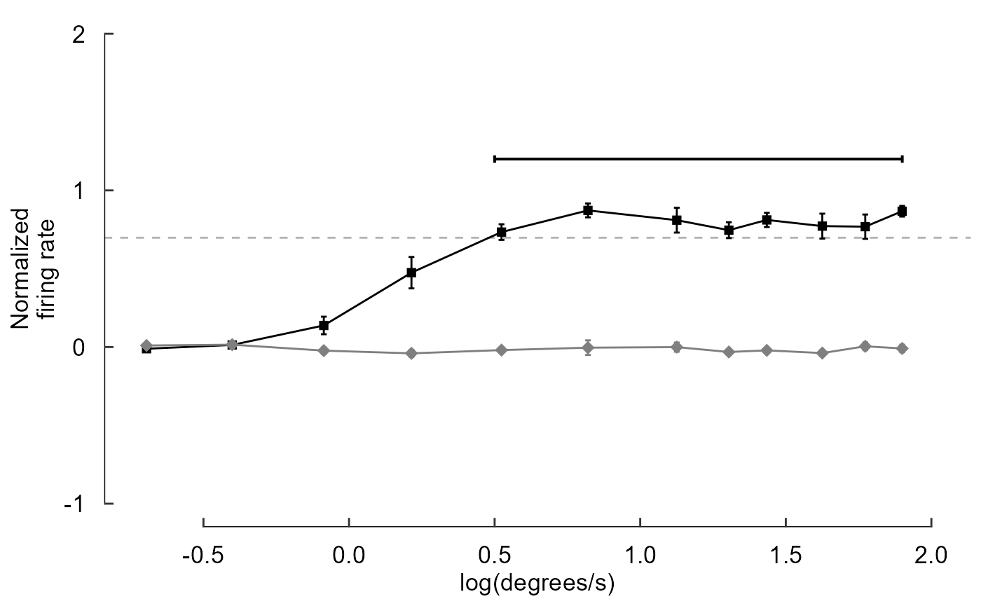
Build a connected-line plot (Figure 3 Panel A):
Panel A is a bit complicated, so we’ll just provide the full code here
# First, import data
fig_A <-
  read_csv("./Fig3A_data.csv") %>%
  # Now take every nth data point (produces plot faster)
  filter(row_number() %% 5 == 0) %>%
  # Clean outliers
  filter(abs(spike) < 7 * sd(spike)) %>%
  ggplot(aes(time, spike)) +
    geom_path(size = 0.1) +
    theme_void() +
    # Y-axis vertical scale
    annotate(geom = "segment",
             y = 0.00278 - 0.01, yend = 0.00278 + 0.01,
             x = -1.5, xend = -1.5,
             lwd = 1.2) +
    # Y-axis scale label
    annotate(geom = "text", y = 0.00278, x = -3,
             label = "0.2 mV", size = 5, angle = 90) +
    # X-axis scale bar
    annotate(geom = "segment",
             y = -0.035, yend = -0.035,
             x = 70 + 1.5, xend = 75 + 1.5,
             lwd = 1.2) +
    # X-axis scale label
    annotate(geom = "text", y = -0.04, x = 74,
             label = "5s", size = 5) +
    # Large ticks
    annotate(geom = "segment",
             y = -0.03, yend = -0.025,
             x = 1.5 + 1:15 * 5, xend = 1.5 + 1:15 * 5,
             lwd = 1) +
    # Small ticks within large ticks
    annotate(geom = "segment",
             y = -0.027, yend = -0.028,
             x = 1.5 + 1:79, xend = 1.5 + 1:79,
             lwd = 0.8) +
    # Arrows
    annotate(
      geom = "segment",
      y = -0.0275,
      yend = -0.0275,
      x = -10 + 2.5 + 1:8 * 10,
      xend = -10 + 5.5 + 1:8 * 10,
      lwd = 1.2,
      arrow = arrow(
        # Control the direction of each arrow. first = left; last = right
        ends = c("first", "last", "last", "last",
                 "first", "first", "first", "last"),
        # Control the size of each arrow head
        length = unit(c(1, 6, 10, 10, 6, 10, 1, 6), "pt"),
        type = "closed"
        ),
      # Use 'sharp' arrow heads
      linejoin = 'mitre')
fig_A